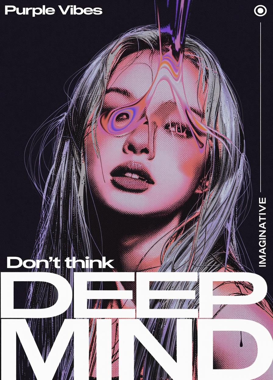


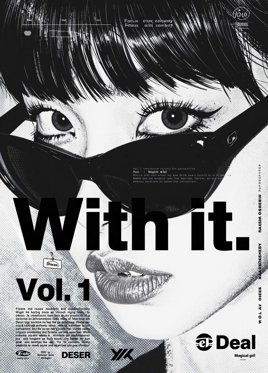


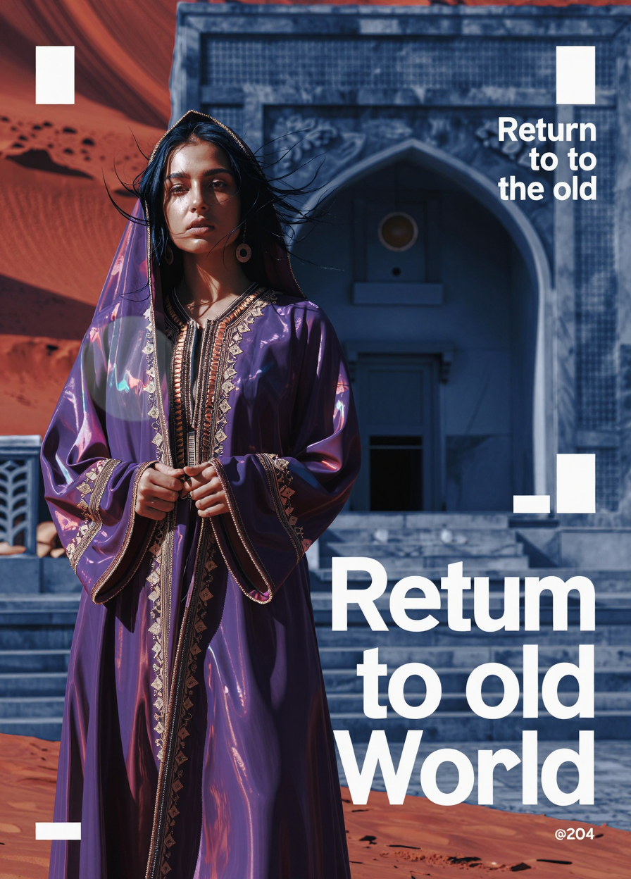
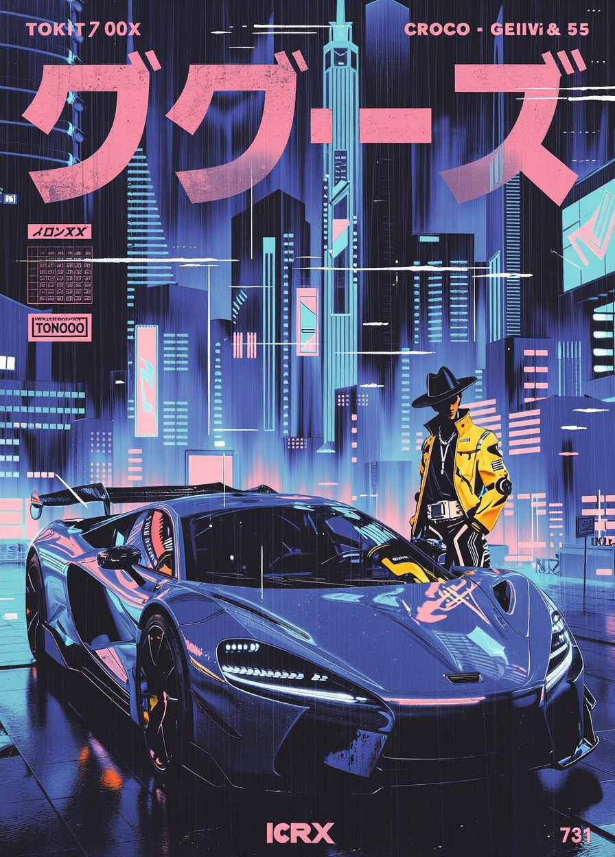


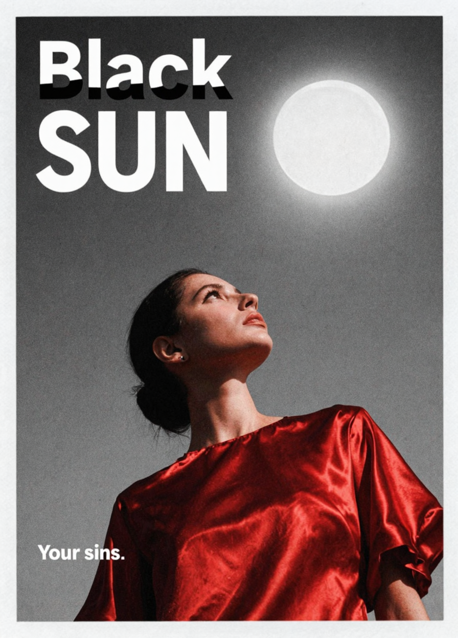


ZIT Weights : 0.8 -1.2
So This is my attempt to exploit Z-images decent text interpretation to make a poster lora.
Please feel free to share your feedback, I am still trying to refine it :)
------------------------------------------------------------------------------------------------
Description
FAQ
Comments (21)
Nice ! a new toy to play with :-)
I hope it works out well for you :D
It works well !
@purplelady It works well :-)
Style meets graphic design. This is a perfect match for the ZIT checkpoint. Your "attempt" at this LoRA, looks to be a professional level result.
Thank you, it was just a random idea but it came out really well :D
looks very interesting, thanks
Thank you :D
This is fun. Overall, the concentration goes up and the film grain is natural.
Thank you for the buzz and the kind words :D
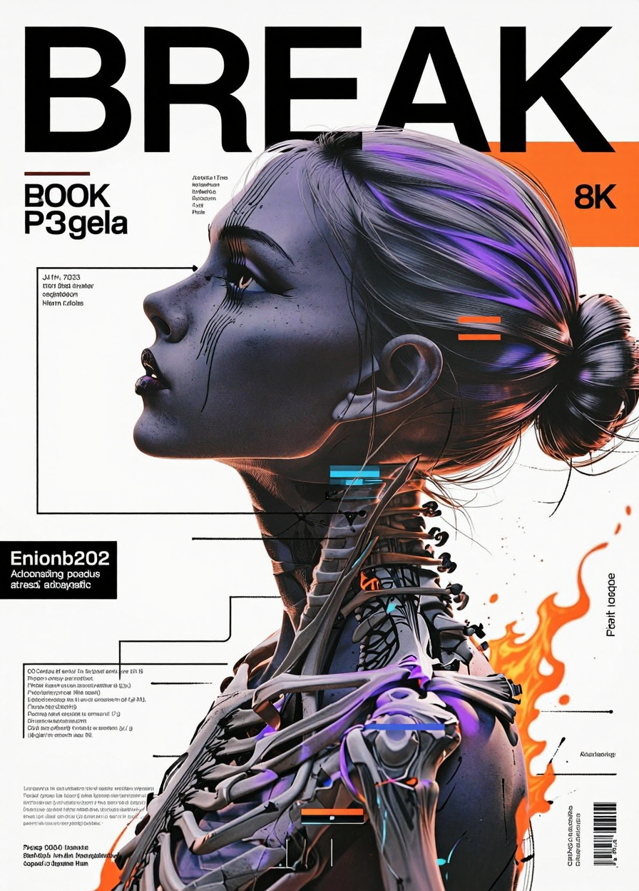
for those trying, i found around 0.8 to be the sweet spot between getting a good effect and get consistent text (no mistakes or errant text ~80% of generations)
If anyone is able to get consistent text at higher levels reply or @ me, I would really love to use this at higher strengths where the graphic effects really starts to shine
one thing you can try is see if moving to eular/simple helps a little i find that some schedulers seem to cause the gibberish effect to be more pronounced
Absolutely brilliant.
Thank you :D
Zimage Base version next!
That is the plan :D
I can state that there is an element of surprise
❤️