


 GEN is a gift, tied with a ribbon and filled with ♥ and if u’d like, u’re welcome to unwrap it. 🎀✨

30 stepsEuler a&DPM++ 2M KarrasCFG 4-7832 x 1216►►1040 x 1510
+ PROMPT example:
masterpiece, best_quality, highres,
- PROMPT example:
low_quality, lowres, blurry
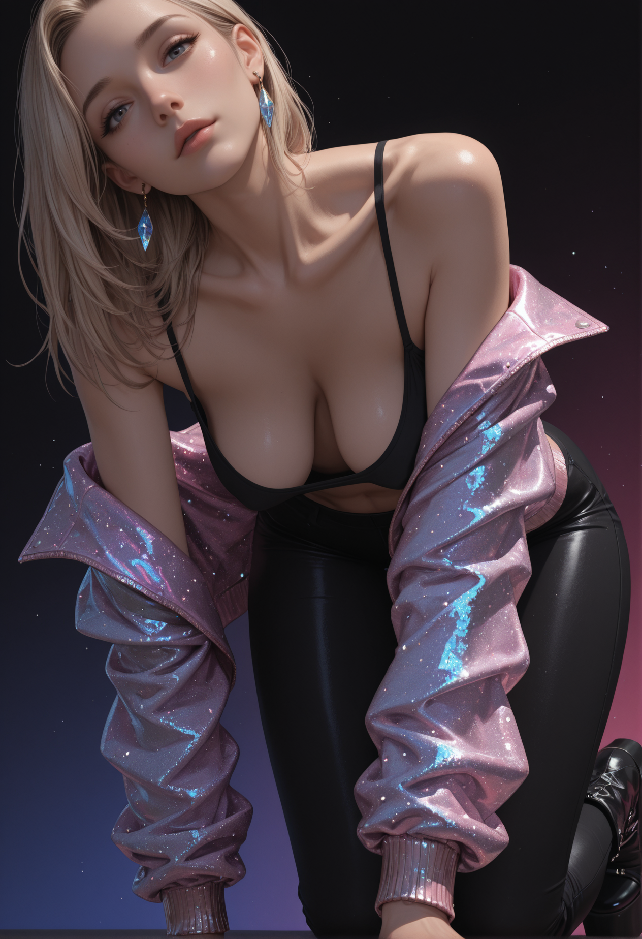
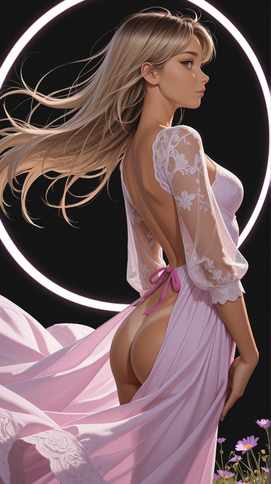
With the development of Illustrij, my style has also evolved: a new balance between SFW and NSFW content, a stronger focus on mature aesthetics, and the portrayal of both femininity and masculinity.
The facial features remain anime-inspired, but with a sharper, more mature form.
This way, GEN opens up a new dimension:
more focus on NSFW,
more mature body structures,
a deeper play of and with light and shadow.
GEN is a project that grows out of itself ~ a step further, a little more mature, and yet still playful ~ Illustrij.
If u’d like to explore GEN together with me, u’re warmly invited. ♥
With ♥ Reij
🎀 GEN v3 ~ a quiet return to the core
GEN began as a gift ~ soft, playful, curious.
With GEN, the intention was to let Illustrij grow older ~ to give her a more mature presence. A new identity was born: GEN.
But somewhere along the way, she drifted into a more illustrative, sketch-like direction ~ gentle, beautiful, yet slightly removed from the dimensional world she came from.
GEN v2 became an experiment in evolution.
Not a reinvention, but a search ~ a question of how far a character can grow while still remaining herself.
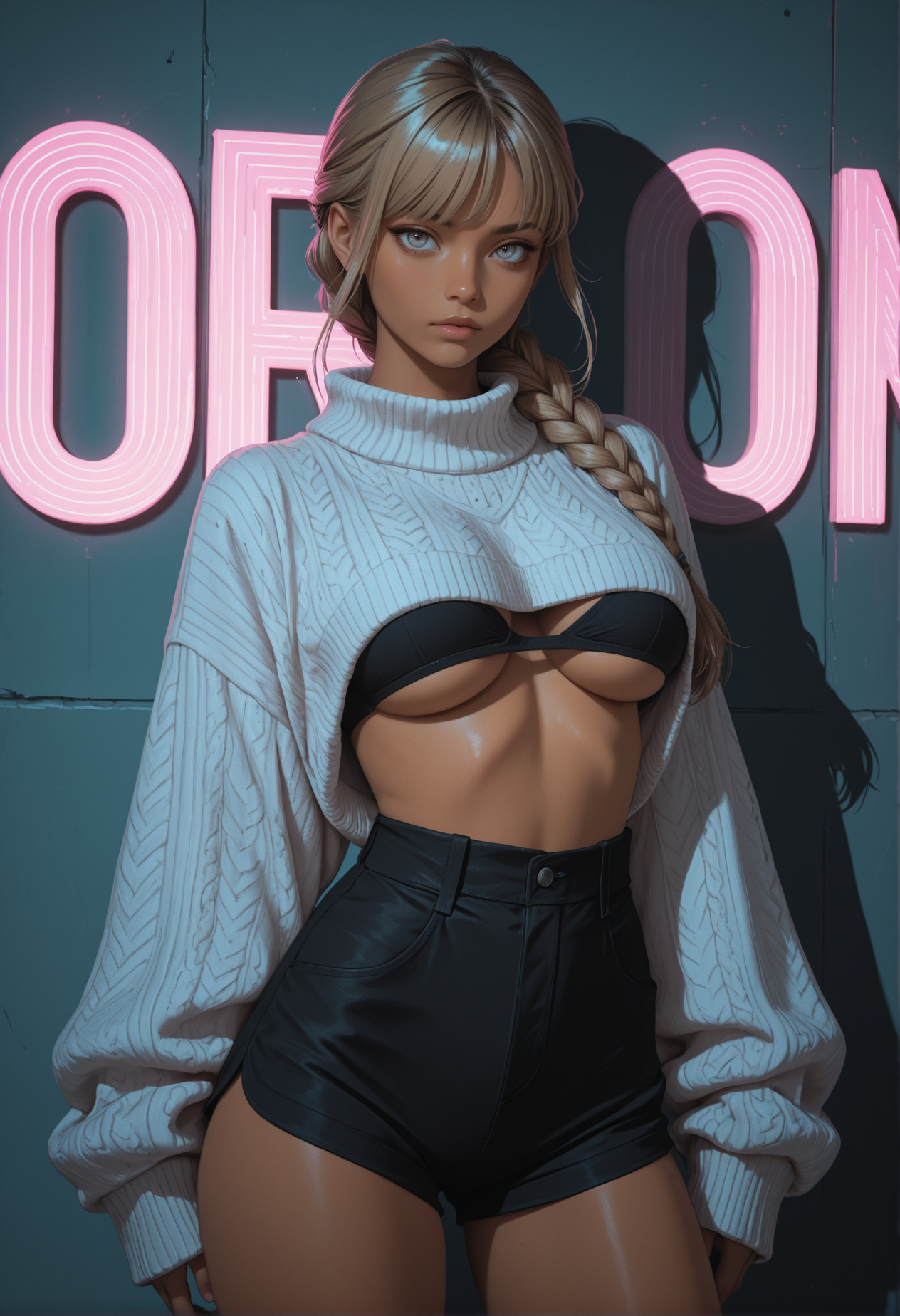
With GEN v3, something subtle changed.
Rather than pushing forward into a new style, GEN found her way back ~ back to depth, to volume, to light that wraps around form instead of resting on the surface.
The illustrative softness remains in her expression, but her presence feels grounded again, almost tangible.
GEN v3 keeps the mature identity of GEN v2 while restoring the dimensional rendering and luminous atmosphere that defined her earlier roots.
She is not younger ~ she is simply clearer.
More sculpted by light.
More aware of her own shape.
Still playful, still open, but with a quiet confidence.
GEN has always been a project that grows out of itself ~ not in leaps, but in gentle shifts, like seasons changing.
GEN v3 feels less like a new chapter and more like coming home, carrying everything she learned along the way.
If you’d like to unwrap this new version of GEN, you are warmly invited. 🎀
With ♥ Reij
Description
VAE baked in
v1 tinkered with
Artistrious https://civitai.com/models/1974650/artistrious
special THX to Jedas ♥
Illustrij EVO 2.2 (not publishes~includes only my own merges and Lora)
Special THX to every creator making these merges possible ☺
FAQ
Comments (46)
Let's see what'cha made of =)
By the first glimpse, works great without lora packs, just as best of Reij's checkpoints, AnimijV1, K-popAlpha and middle models of Illustrij
thank u very much 4 ur comment ^^
hope u have fun trying it out :)
@reijlita i'm really looking forward to it. Animij1.2 was great, so i have high expectations for this one too )) Glad to see you still having fun with your creations and giving us something new to try :)
By the way, could you give any advice to help skin in generations not look plastic? Common problem with all latest IL checkpoints, maybe you as a checkpoint creator can point out something? =)
@Tyomanator thank you for the kind words. I'm very happy if you like animij and stay curious abt ur creations ^.^
I'm always happy to relax a little while generating images ^.^ and when I can share my tinkered merges with u ^^
@Tyomanator Personally, I like the mix between 2D and 3D, so that depending on the prompt, it looks subtly cast, i.e. with light reflection.
I've never had it look like plastic before.
I would have to do tests with a lower steps, but I can only imagine that it could be due to a specific tag or quality tag :I
@reijlita Maybe it's just my personal feeling, IDK... Can't speak for this checkpoint as i didn't try it yet, and Animij1.2 certainly didn't have it, but from many other IL checkpoints released since this spring (i do not mean your checkpoints specifically, but the ones i see onsite in general) i got a strong impression of "plastic skin". I remember the wonderful skin your K-POPalpha produced once, so decided to ask if you noticed that effect and have any recomendations )) Once again, it could be my personal eyes and taste )))
@Tyomanator I suspect that sometimes it is also due to loras merged in maybe. For example, I also made one to get more depth, i.e. more 3D. As a result, Illustrij, for example, became too glossy for my taste ^^ In general I would recommend writing e.g. glossy skin or shiny skin in the negative prompt or e.g. 3d. alternatively 2d into the positive, depending on the model. Sometimes the CFG can also have an influence, e.g. some of my models often become brighter at higher CFG and remain more saturated at lower CFG. Maybe that helps a little. natural skin can help, but depending on the situation, it can also have a reinforcing effect :I
@reijlita Thank you, i'll try it. Some things, like adding 3D to neg. prompt, couldn't come to my mind, so thanks very much =)
@Tyomanator ur very welcome :) sometimes that helps a little to make the image look more matte. If you still want depth, you could write depth of field again in the positive prompt or rim light in negative
Why, something in between sugar and spice and everything nice and snips, snails, and puppy dog tails, I'd imagine.
@ElsewhereOtherwise Could you kindly tell where from is this quotation?
@Tyomanator It's a nursery rhyme called "What Are Little Boys Made Of?"
"What are little boys made of?
What are little boys made of?
Snips, snails
And puppy-dogs' tails
That's what little boys are made of.....
What are little girls made of?
What are little girls made of?
Sugar and spice
And everything nice [or "all things nice"]
That's what little girls are made of"
It was just something from my childhood that came to mind when you said "let's see what'cha made of" because, you know, not only does Reij like to exist in the in-between but also mentioned this model dabbles in both the feminine and masculine.
https://en.wikipedia.org/wiki/What_Are_Little_Boys_Made_Of%3F
@ElsewhereOtherwise Ah thanks! Now I even remember an old soviet cartoon on this nursery, just couldn't associate it at the moment =)
@Tyomanator That's too funny... we grew up on opposite sides of the Cold War learning the same nursery rhymes... <3
@ElsewhereOtherwise Actually pretty lot of those english rhymes were brilliantly translated by Samuel Marshak somewhere between 1930ies and 50ies and were very popular, alike with Robert Burns poems (whose songs are still loved by many) and R.L. Stewenson novels, and lots of other english and scottish classics. Soviet culture tried to adopt all the best from all around the world, especially for child and youth reading...
My friend, thank you for your work, they are the best. They were the ones who made me switch to Illustrious.
thank u very much 4 ur kind comment ☺ I am very happy if u enjoy playing around with my models and that you enjoy illustrious^-^
Am cooking...
thank u very much 4 ur comment, Im curious to see ur creations ☺
@reijlita I got inspired by your preview pictures for this model 😅 Anyway i posted a pic 😎
@Leemnyx great image ^^ love the painted hearts ^-^
@reijlita Thx! Love you models, thank you very much for making them, so we can create some beautiful stuff ❤️❤️❤️
@Leemnyx thank u very much 4 ur kind words ^.^ glad if u enjoy exploring these small playgrounds^-^ in our giant AI universe ^^
Looks like I found my checkpoint for this Scream Season. 🎃🦇👻
hey ☺ how kind of you ^^ I'm very happy and I'm excited to see what you conjure up
@reijlita Yeah, it feels like you made this checkpoint just for me. The description you provided is exactly the approach I have been hoping for. I am wrapping up an animated comic, "The Bad Bounty" coming out later today and then I will get to work on the Halloween lineup using Illustrij-GEN.
@RLS_Animation ooh then I'm excited^-^ I'm very pleased that GEN appeals to you :)
Have fun being creative ^^
Feel very good to use, very smooth and responsive, continue the great work ! ❤️
thank u very much 4 ur kind comment ^-^ I am very happy if u enjoy generating images with GEN ☺
Having made a lot of merges, i'm using them for most of my last generations. But when i saw an "Illustrij-GEN", i had to give it a try. I can feel the Illustrij taste in it. And i like it ! Thanks for this new gift !
thank u very much 4 ur kind words ^-^ I am happy if u enjoy generating images with GEN ☺
In realistic, i found that GEN is little lower than EVO while using the same tags,lora. Is that right?
hey, Both EVO and GEN are not realistic models, they are maximally semi-realistic ^^
In terms of look, both remain in their look, stretchy to varying degrees, but not realistic. ☺ even if EVO tends more towards realism than GEN, both are rather semi-real :)
@reijlita yeahyeah,exactly to say,it's called semi-realistic.
Reijlita, you really produce so much good stuff that I am overwhelmed. I'm running out of space on my hard disk. I really need a way to better differentiate some of your models...
thank u very much 4 ur comment ☺ happy if u like em.
the difference remain subjective, Id say ^^ showcase images are always just my perspective, and only a mini part of what is possible ^^
Either one playground invites you to play or another is more convincing ^^
I have the same problem. And no matter what test scenario I come up with (pictures with poses, important triggers, creativity, style), there are always more checkpoints. :-) Yeah. I guess I'm a checkpoint collector. Many checkpoints are really bad. But with the right creators, almost all of them are good. And the differences are fascinating.
Early results on this did not appear to "mature" the persona much, neither in body nor facial features. At least not by default (while using generic prompts not specific to age or development). It definitely does sharpen the image overall though, in comparrison to Illustrij. Certainly worth toying with some more, as a User.
Tough to beat the aesthetics I can count on with Illustrij. I prefer the softer hue that offers overall and the color palette is persistently perfect (color looked nice on this as well, for the record). Illustrij just bleeds... I dunno... breaking through vunerability. It's got an affecting grasp on... you know... those - yup - spaces in between.
Not that you should settle for that and not continually bust your ass to develop more options. Do your thing, girl. Break boundaries.
I love the models coming from reijlita, but I have a hard time understanding the difference between them all. Like for exampel -- this one vs Illustrij vs Lusterij. Can anyone explain further please?
I think they all produce superb results.
hey thank u very much 4 ur kind comment ☺
I generally prefer to look at what makes something special rather than comparing something^^
That's why I always make an effort to explain these aspects in the showcases or in the descriptions.
All models are small invitations to explore playgrounds.
So that this can happen as freely as possible, I try not to anticipate too much from my perspective here. because it limits the view when I make a frame. :I
showcases are also just momentary shots - but I'll make an effort here to give a look at the look I had in mind when merging^^
That's why I leave my prompts visible so that everyone can easily recreate them and see which prompt structure led to the picture.
Basically, each model brings its own look and style.
So that an independent exploration of a model can of course be carried out as freely as possible, it is always important to me that the hidden object game is fun^^ by that I mean that we have an idea in mind and can build it step by step.
With the newer models I have placed more focus on creating both ladies and gentlemen.
The biggest difference between the models is their own look.
The biggest thing in common is that they are all intended to be an invitation to explore your own imagination - with as much fun as possible.
That's why I try to make sure when tinkering that it's beginner-friendly - but also leaves room for prompt professionals^^
Since I mostly create images without loras, embeds, etc., I tinker a lot with my own styles to just give us more room to play ^^
Of course, the models can also be used with it - but I would like to create a playground with more options
So when it comes to deciding: I can only recommend trying it out and finding out based on your own feeling what you like and what you don't :) The showcases offer an initial impression, but always keep in mind that there are a maximum of 20 pictures, this is just a mini excerpt :)
I hope you can work in more men in these models, so to get a healthy mix of both genders. Again, excellent work.
best model!
you're such a gem reijita, thanks for your contributions to the community and keep up the great attitude!
thank you so much for your kindness ♥ ♥
I just now noticed that I didn't reply to your friendly comment :O
But I would like to thank you again, that means a lot to me
still remember the first time I read the comment and know that I was very happy about it. I wanted to express that and it happened later than I had planned ^-^
@reijlita <3 :D :D :D
Details
Available On (3 platforms)
Same model published on other platforms. May have additional downloads or version variants.