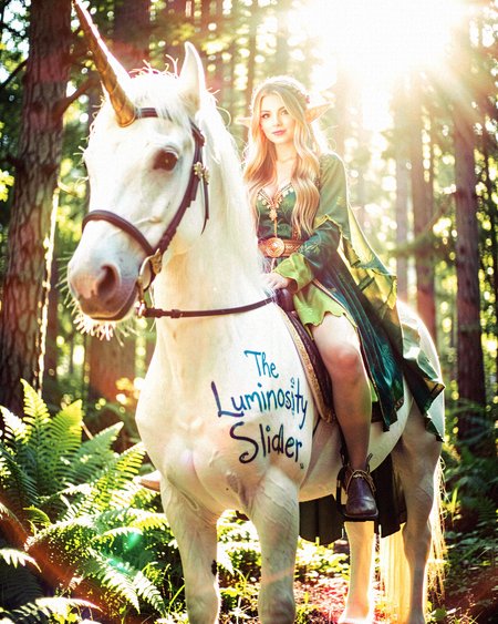
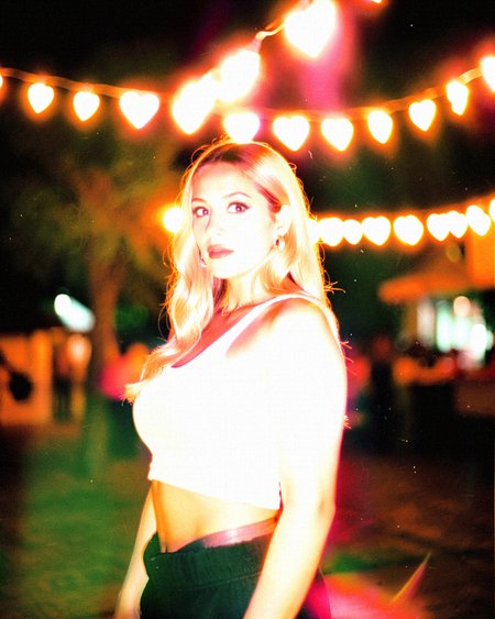
This control adjusts the overall brightness and colour saturation of your image, taking it from muted and desaturated to vibrant and glowing.
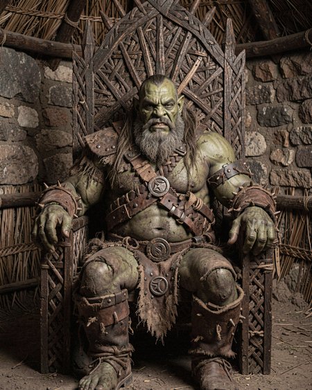
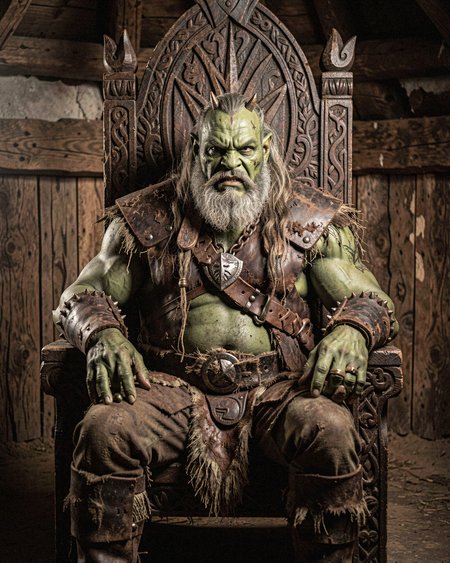
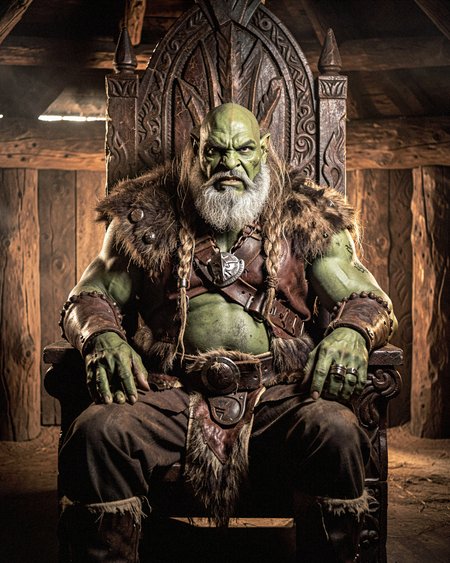
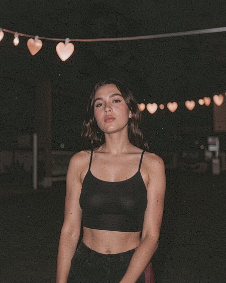
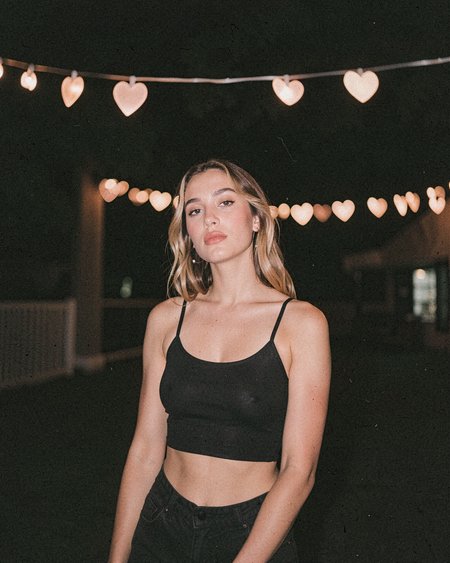
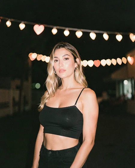
At -10 (lower values): Everything gets darker and more washed out. Colours turn grey and subdued, shadows get heavier, highlights dim down. It's got that overcast, moody vibe, like shooting on a cloudy Tuesday when the world just feels kinda flat and blah.
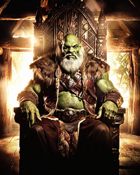
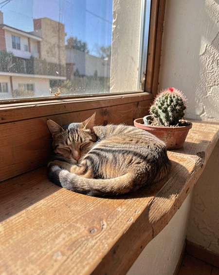
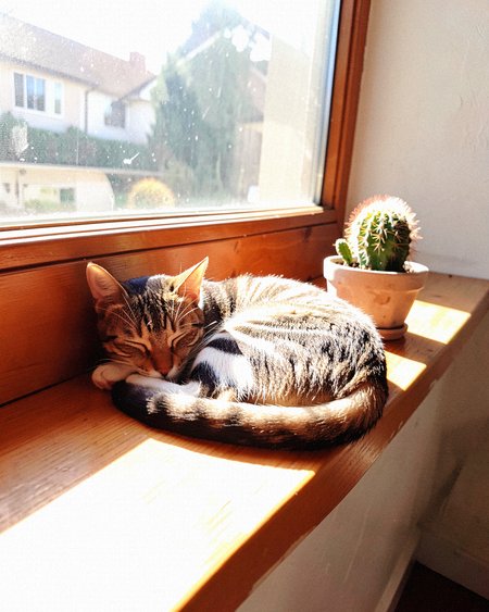
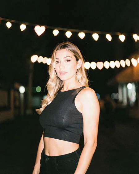
At 1 (neutral): Pretty much what you'd expect from a normal, well-exposed photo. Balanced lighting, realistic colours, nothing too crazy. Just... regular. Which is fine! Sometimes regular is exactly what you need.
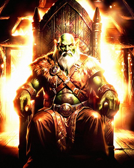
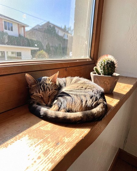
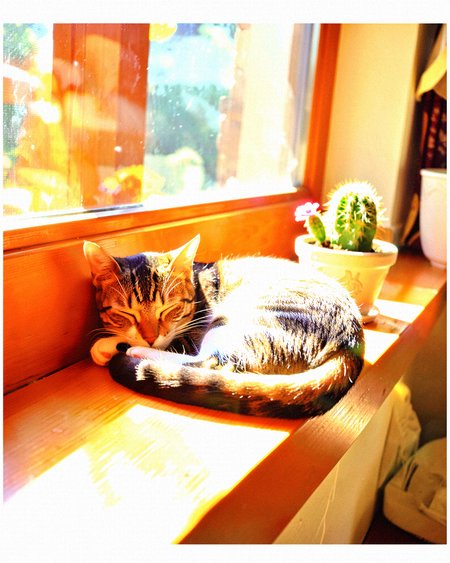
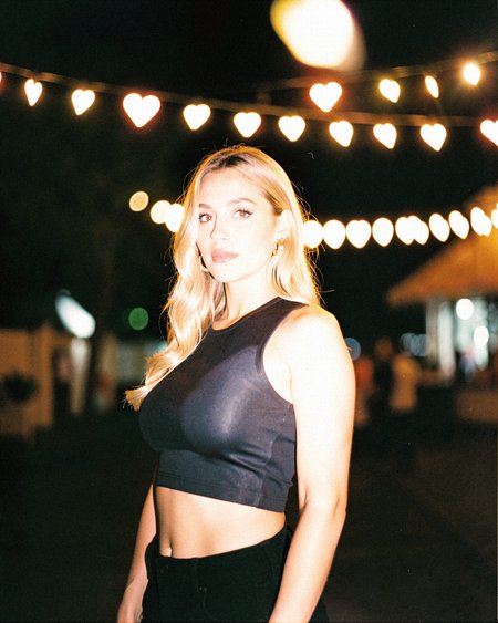
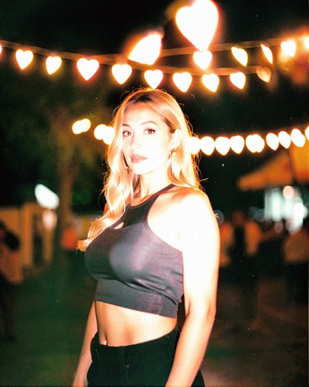
At +10 (higher values): Here's where things get spicy. The image gets way brighter and more saturated. Highlights start glowing, shadows lighten up, colours absolutely pop. You get that dreamy, sun-drenched look with blown-out highlights and this golden, ethereal quality. Basically golden hour but like, turned up to eleven.
So yeah, you're going from "meh, grey Tuesday energy" to "literally walking through a halo of angelic light." The whole dull-to-dazzling spectrum, you know?
Fair warning though: It's not perfect. The model does shift composition at stronger values, it's just how it works. Might revisit this later if people really want it dialled in, but for now it does what it does.
Description
FAQ
Comments (1)
Thank you for all your excellent sliders!