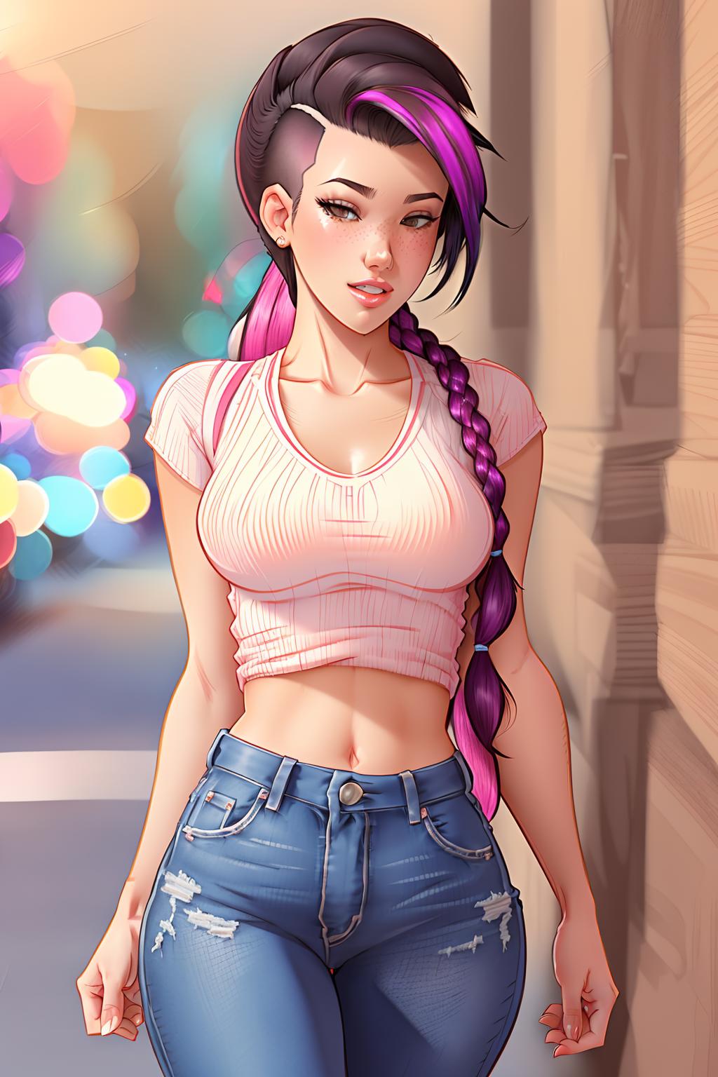
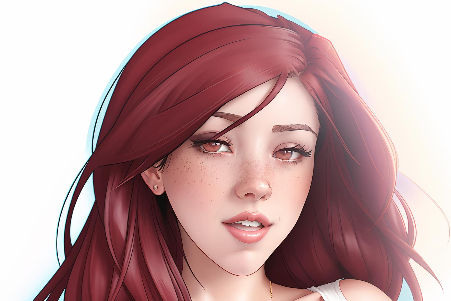
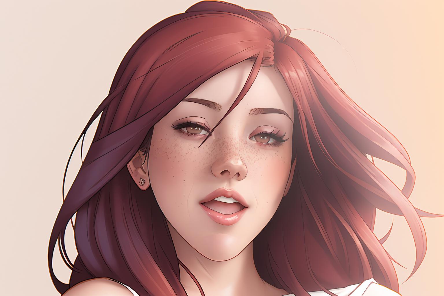
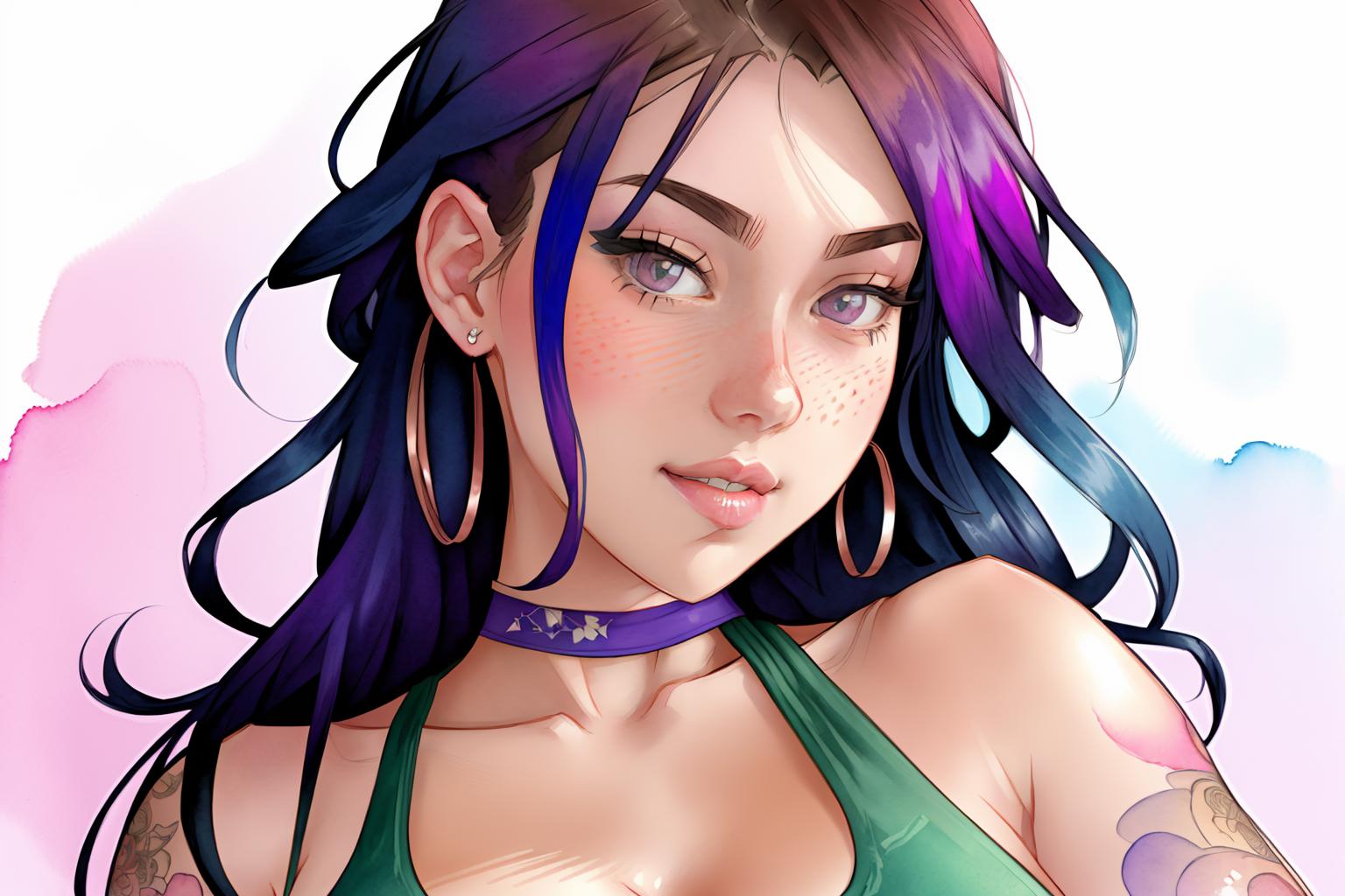
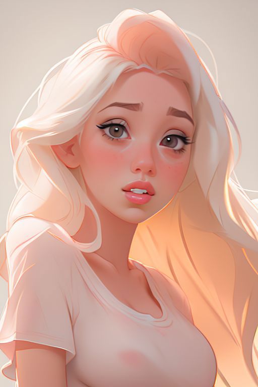
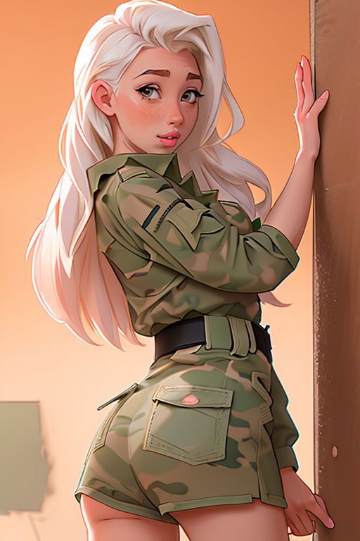
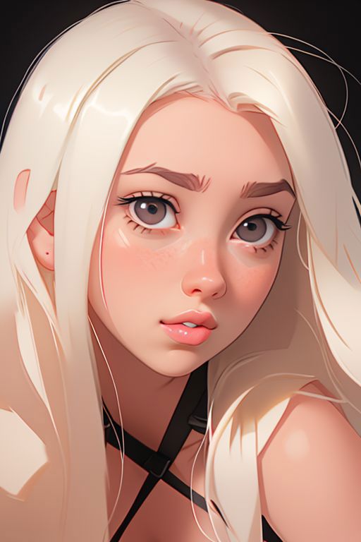
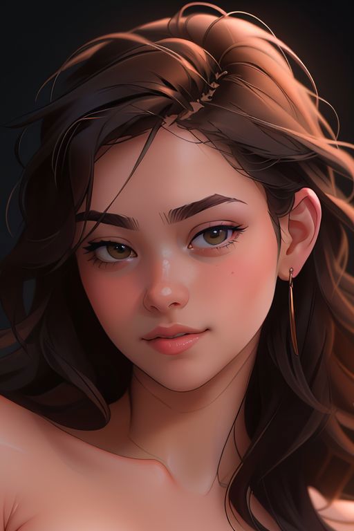
I don't think I do a good job with styles. I do something wrong in the text or data set choices, or maybe I just don't use enough consistent images. This was done with circa 100 consistent styled images.
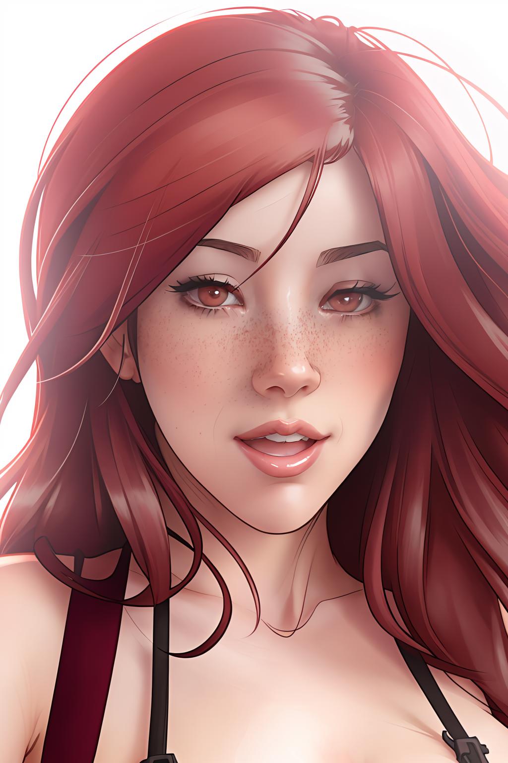
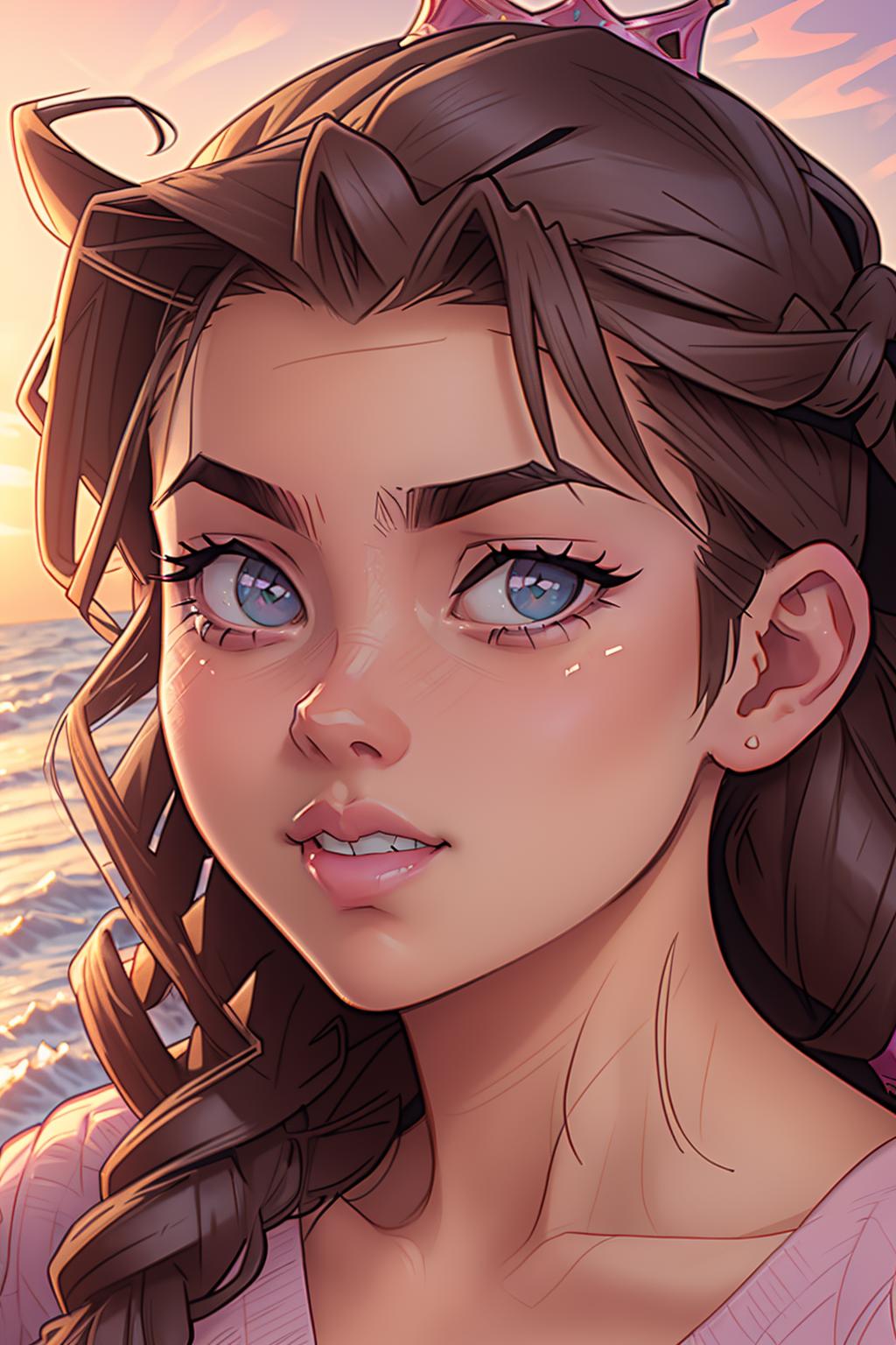
This one has a strange love of the colour blue which you will see in the grid image and previews. Randomly some images just love to turn up in a blue monotone and I really can't understand that as nothing in the dataset looked close to this. Strangely I kind of like it but I haven't figured the negative prompt necessary to stop it, but I would love to control it more as I think this could work will if you can dictate the colour or gradient of the effect.
the sweet spot seems to be around 0.8 I think, and the results vary massively depending on the model you use. I have found the Babes checkpoint to produce best results, as it is complementary to the art style regardless.
Description
Just trying to refine and improve. I'm not sure if a prefer the original or not, the new version maintains a better standard, but the original does create a more comic-esque style I enjoy.
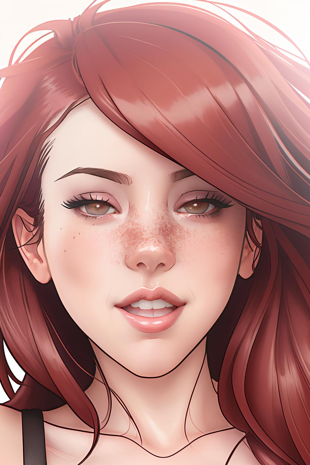
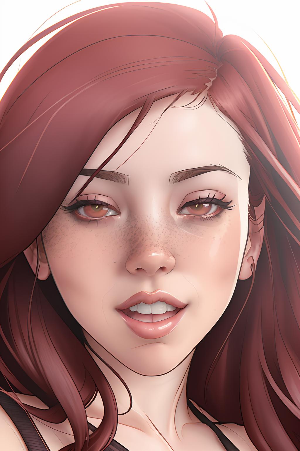
I have found using the [From:To:When] prompt good for preventing the inversion from completely changing the image. If you make something you want to apply the style too try out [():DEN_melkorMK2:15] and it will create the base and start the style from step 15.
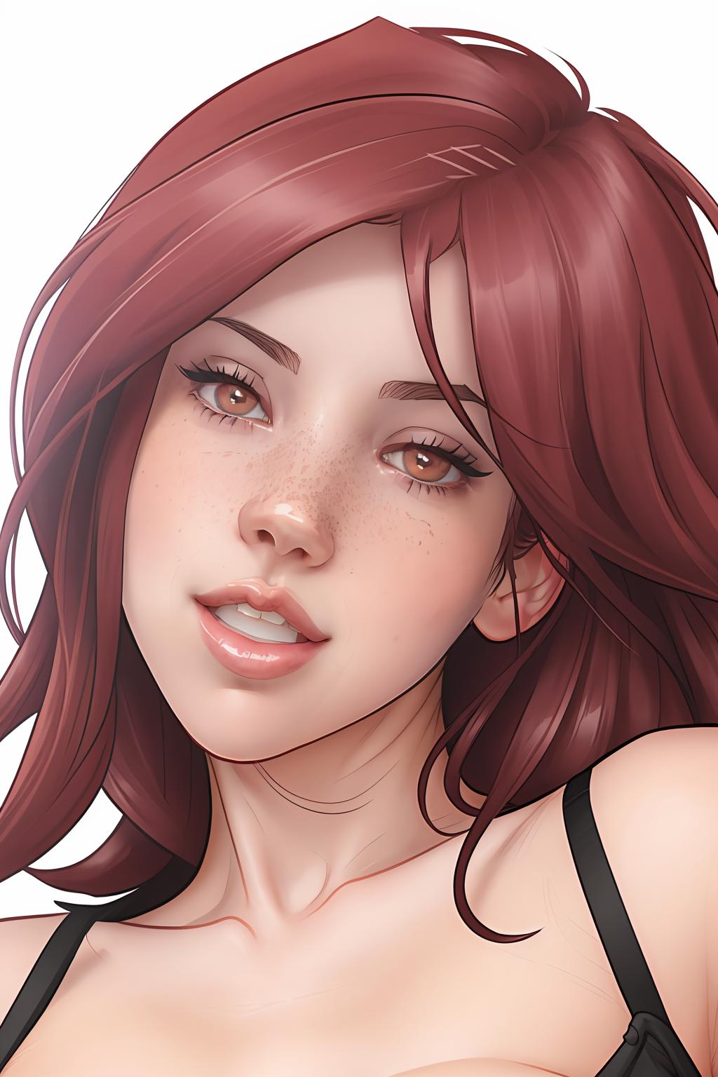
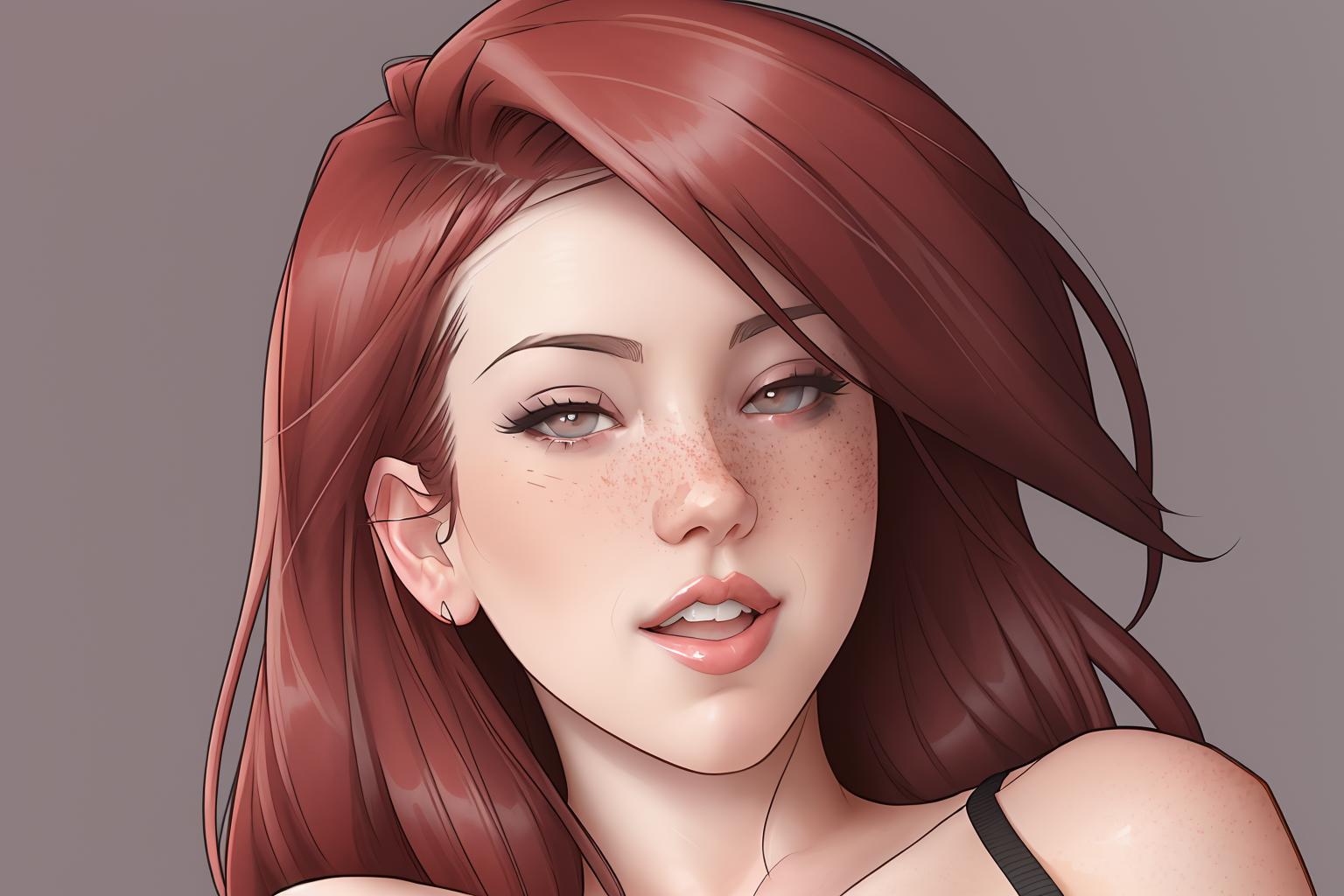
As ever i really want to see peoples work from these, so please upload and share.
Details
Files
Available On (1 platform)
Same model published on other platforms. May have additional downloads or version variants.