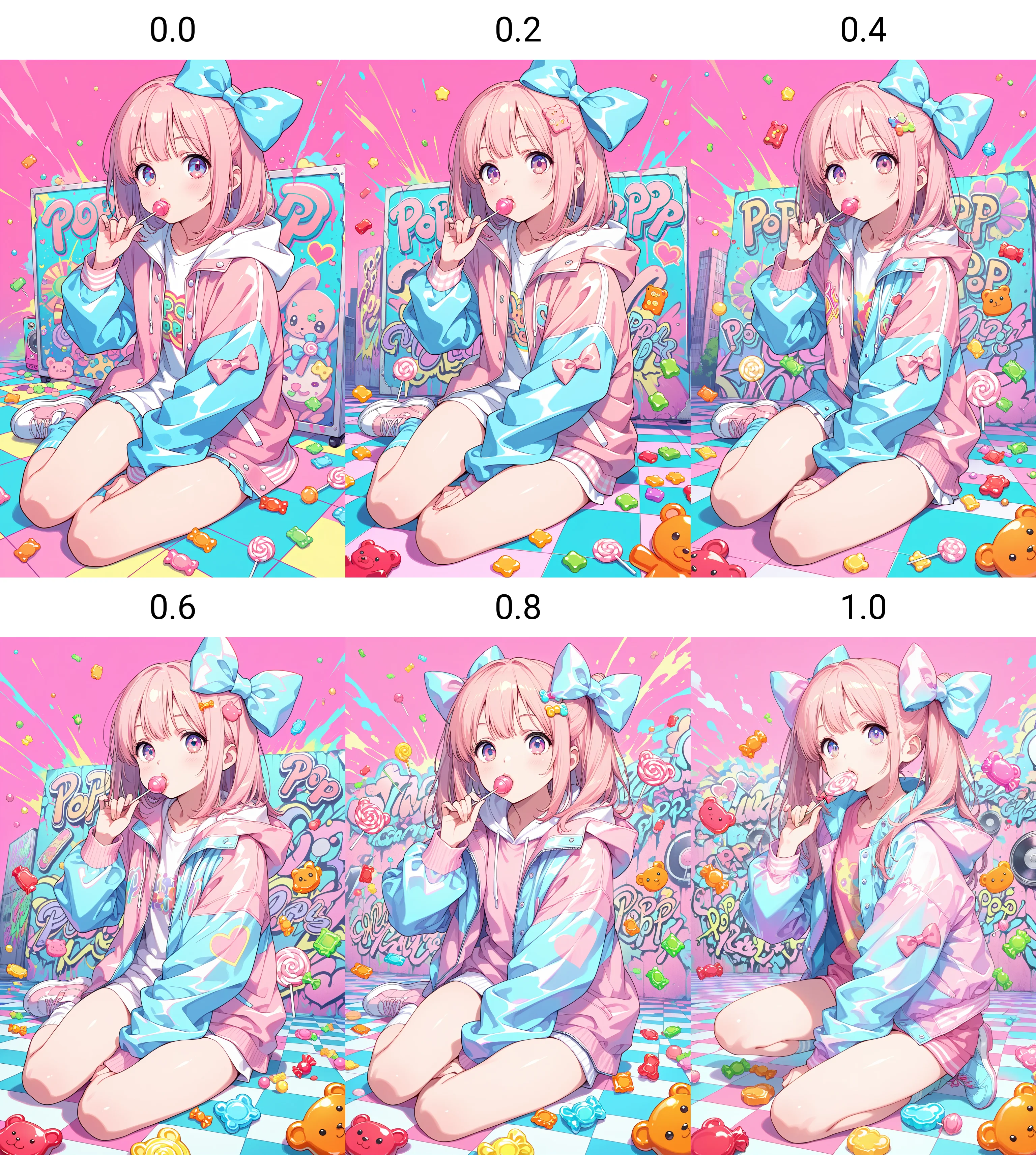
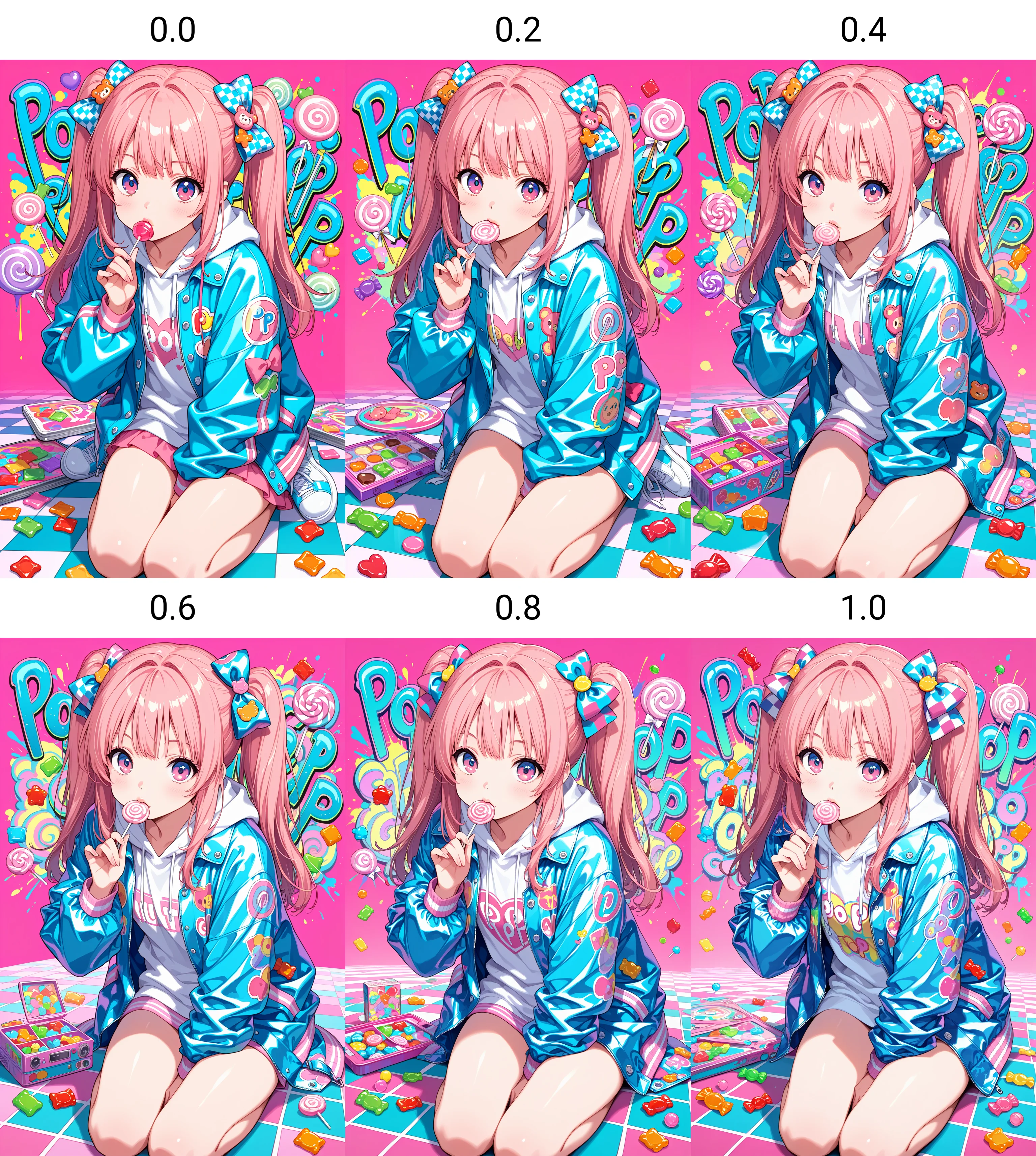
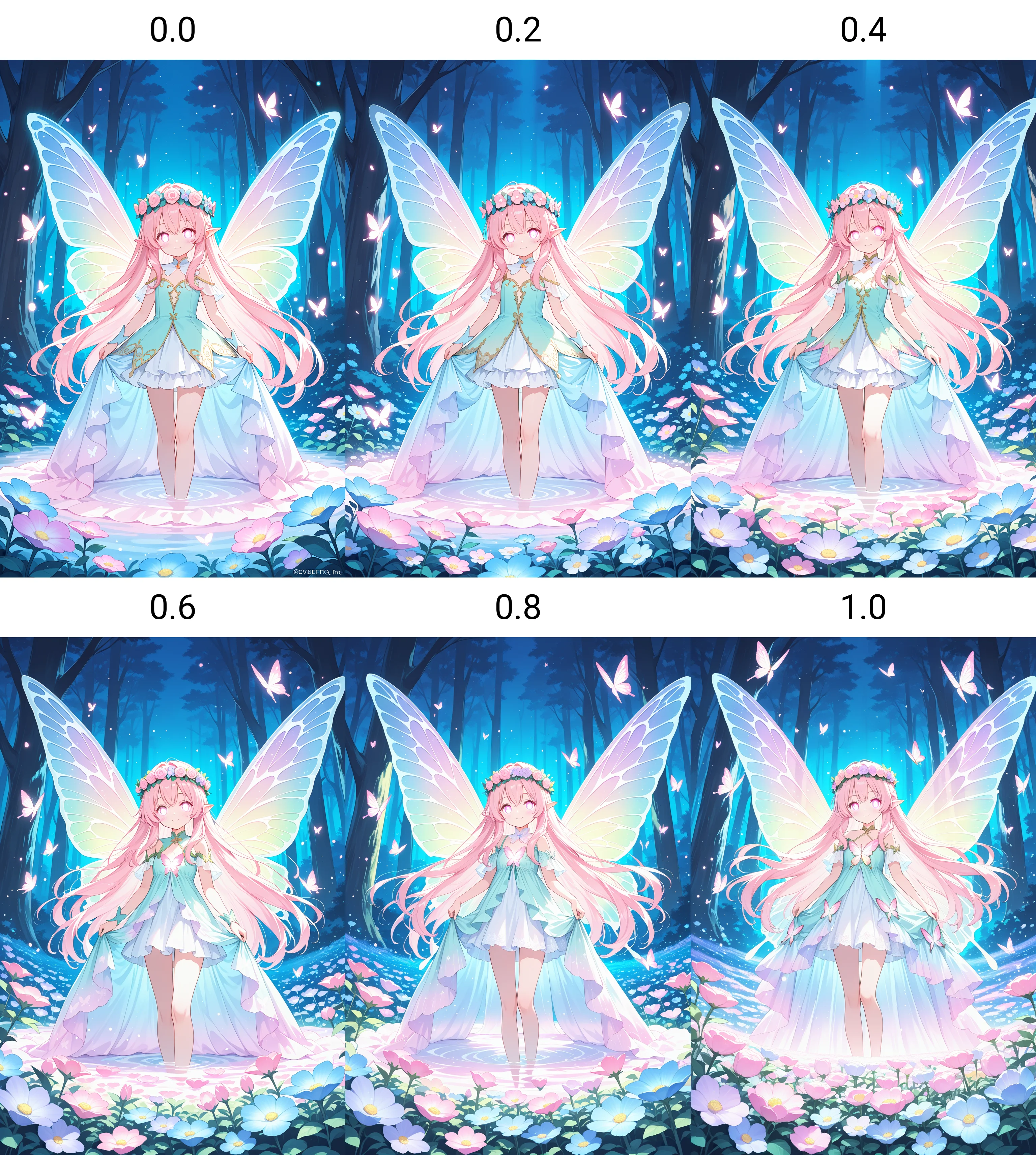
様々な生成画像を、元の色相をなるべく保ちながら、明度・彩度・コントラスト・ガンマを調整してパステルカラー方向へ再加工し、その色調変化を学習させたカラー調整LoRAです。
学習用キャプションから色名や「pastel」などの色調表現を除外することで、特定のプロンプトに依存せず、LoRA強度によって色味を段階的に調整できるよう設計しています。
ビビッドでカラフルな画像の色を柔らげたり、パステル系Checkpointの色調をさらに強めたりする用途に適しています。
画像を別の画風へ描き直すLoRAではないため、最初から淡い色調の画像や、白・黒など無彩色を中心とした画像では、変化が目立ちにくい場合があります。
元画像に含まれる色や使用するCheckpointによって効果は異なります。
強度0.1~1.0では、元の構図やキャラクター性をほぼ維持したまま色調を調整できます。1.0を超えると粗さや破綻が出やすくなるため、推奨範囲は0.1~1.0です。
トリガーワードは不要です。
A color-adjustment LoRA trained on 500 diverse images that were reprocessed toward pastel tones by adjusting brightness, saturation, contrast, and gamma while preserving the original hues as much as possible.
Color names and tone-related terms such as “pastel” were from the training captions, allowing the LoRA to learn the visual color transformation itself without requiring a specific prompt.
It works especially well for softening vivid and colorful palettes or strengthening the pastel characteristics of pastel-oriented checkpoints.
This LoRA does not repaint an image into a completely different art style. Its effect may be subtle on images that are already pale, low-saturation, mostly white, or dominated by neutral colors. Results vary depending on the original palette and the checkpoint being used.
At strengths between 0.1 and 1.0, it generally adjusts the color tone while preserving the original composition and character. Values above 1.0 may introduce roughness or artifacts.
No trigger word required. Recommended strength: 0.1–1.0.
◯他モデルもよろしくね!