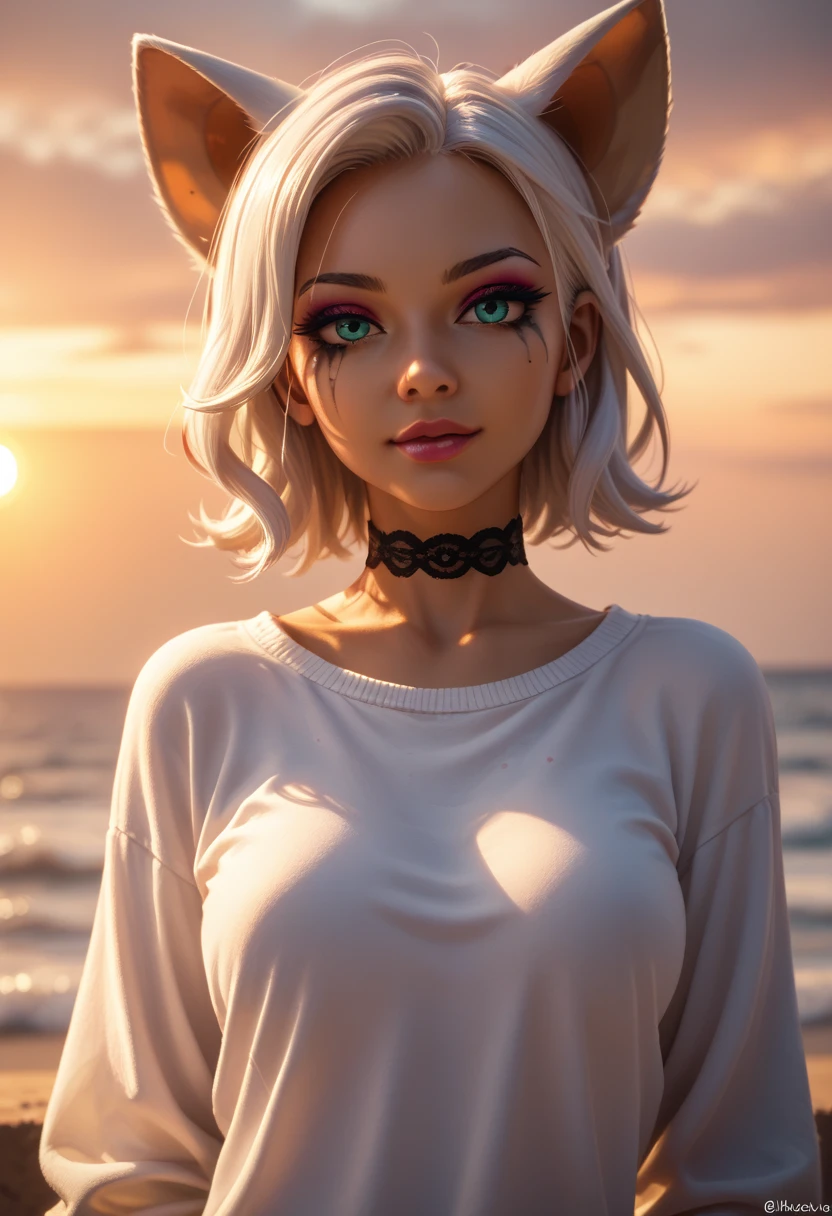

Prompt Recommendations:
When it comes to prompts that is really up to you. Here is some advice:
- Please be careful on the strength you add to LoRas as this can affect the overall look with the checkpoint. Stronger does not always mean better. I normally run 0.4 - 1 strengths depending on the LoRa.
- What is first in your prompt has higher priority.
- Having parathesis increases a priority, but having everything in them is almost as good as typing without them.
- Subtle changes in a prompt (to include punctuation) can change the image
- The seed helps in producing similar images with similar software and settings. It does not guarantee the same image as even a difference in software (I.E. ComfyUI) or hardware can affect it.
- If you want a more cartoon look (at least with this checkpoint) use the following near the front of the prompt: Anime, Cartoon, painted, or comic. This does not guarantee a look depending on the version; but it will lean more that way. This also works for Realistic looks (Realistic, real, etc).
- If you want Safe for work or not ?????? to show up then make sure you put the following in your negative prompt: ????, ??????, ?????, NSFW, ???????. Of course if you have this in your actual prompt then it will more then likely do it.
- The following is what I normally run in a negative prompt:(bad quality:1.3),(worst quality:1.3),watermark,(blurry),5-funny-looking-fingers
Description
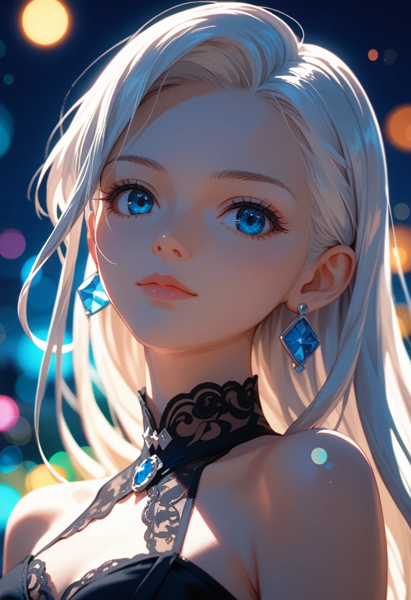
Prompt Recommendations:
When it comes to prompts that is really up to you. Here is some advice:
- Please be careful on the strength you add to LoRas as this can affect the overall look with the checkpoint. Stronger does not always mean better. I normally run 0.4 - 1 strengths depending on the LoRa.
- What is first in your prompt has higher priority.
- Having parathesis increases a priority, but having everything in them is almost as good as typing without them.
- Subtle changes in a prompt (to include punctuation) can change the image
- The seed helps in producing similar images with similar software and settings. It does not guarantee the same image as even a difference in software (I.E. ComfyUI) or hardware can affect it.
- If you want a more cartoon look (at least with this checkpoint) use the following near the front of the prompt: Anime, Cartoon, painted, or comic. This does not guarantee a look depending on the version; but it will lean more that way. This also works for Realistic looks (Realistic, real, etc).
- If you want Safe for work or not ?????? to show up then make sure you put the following in your negative prompt: ????, ??????, ?????, NSFW, ???????. Of course if you have this in your actual prompt then it will more then likely do it.
- The following is what I normally run in a negative prompt:(bad quality:1.3),(worst quality:1.3),watermark,(blurry),5-funny-looking-fingers
FAQ
Details
Downloads
4,680
Platform
SeaArt
Platform Status
Available
Created
11/4/2024
Updated
9/17/2025
Deleted
-
Trigger Words:
scifi
woman
cartoon
realcartoon
fantasy
Files
Available On (5 platforms)
Same model published on other platforms. May have additional downloads or version variants.