

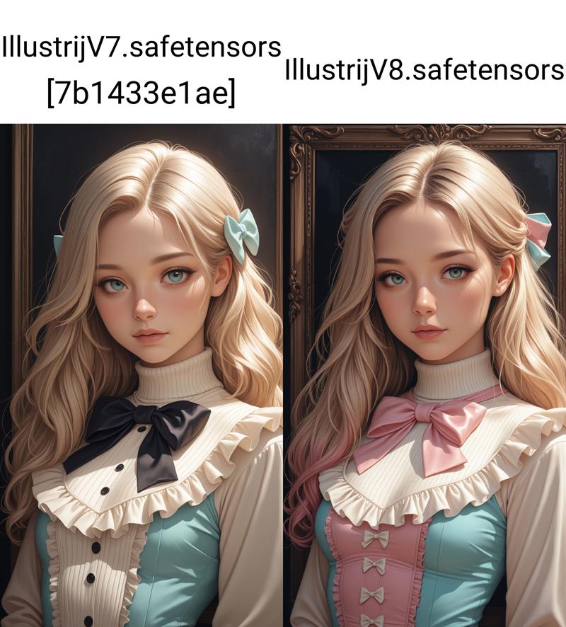
hey guys, ☺
as u know I rlly love comic-anime-hybrid based checkpoints and digital art rendering with a touch of 3D on its way to semirealism. So I've thought it would be time to test Illustrious. This is how I wanna present to u ~ Illustrij ~ my first merged Illustrious checkpoint :)

NEW ♥
💌 v21
"Illustrij ~ imperfectly authentic, a real little nose dimple.
Yes, you heard right ~ there she is: a quiet presence, simply there.
Ready for adventure.
Illustrij, a moment of possibility ~
ready for encounter."
Want to meet v21?
She’ll introduce herself:
♥ https://civarchive.com/articles/26631
🎶 about v20
Hey friends,
I’m happy to introduce v20 ☺
Your feedback really counts ~ and you can feel it here.
v20 leans more toward v18 in look, attitude, and overall style: very Illustrij, just a little more grown up ^^
This new version also includes one of my private LoRAs, based on my artificial handwriting.
I hope you enjoy exploring with Illustrij as much as I do ✨
with ♥ Reij
💎 | Setting (option examples):
Euler a • steps 30 • CFG 7
💎 | Hires Setting (option examples):
832x1216 💎 Hires x 1,5 • Denoising strength 0,4 • Hires steps 10 • Hires CFG Scale 4
832x1536 💎 Hires x 1,5 • Denoising strength 0,2 • Hires steps 10 • Hires CFG Scale 2
💎| Quality Tags (option examples):
| + | masterpiece, best quality,
| + | masterpiece, best quality, ultra-detailed, 8k resolution, high dynamic range, absurdres, stunningly, intricate details, sharp focus, detailed eyes, cinematic color grading, high-resolution texture
| ~ | worst quality, bad quality,
🎶 about v19
sooo… Illustrij update? I’d say she’s matured^^
“grown”? more like years instead of months :P
~Illustrij spawns: more NSFW focus, more adult vibe ~ that’s important to me.
perfection? I say: creativity!
Illustrij ~ a mirror of my own excursions, adventures, and discoveries in the AI world^^
of course with lots of love and curiosity ♥
artistic, sensual eroticism… a part of me.
spark-seeker? yes?
and definitely a fan of shadow-play ^^
illustrij reflects this shift in my artistic sense ~
and still remains completely illustrij: stubborn, playful, full of surprises,
and always an invitation to dream, explore, and be creative ^^
I’m super excited and curious to see what you create ^^
feel free to tell me if you enjoy this adventure.
I’m happy about every heart traveling along with Illustrij :)
with ♥ Reij
| ♥ | Specs: Euler a / DPM++ 2M Karras· 30 Steps · 832×1216 · CFG 4-7 · Hires ×1.5 · SFW & NSFW
| ♥ | quality tags option examples:
| + | masterpiece, best quality, ultra-detailed, 8k resolution, high dynamic range, absurdres, stunningly beautiful, intricate details, sharp focus, detailed eyes, cinematic color grading, high-resolution texture,
photorealistic,
| ~ | worst_quality, bad_quality, poorly_detailed,
💌 NEWS for ♥ hearts that grew with the v6 line 🎶
Illustrij BTTR https://civarchive.com/models/2060715?modelVersionId=2331934
is the natural continuation of the v6 era ~
a soft fusion of past and present.
Back to the roots ~ the handwriting of what once was, now glowing again.
for those who still feel the light between present lines. ✨
🎶 about v18
Ur feedback is important to me ☺
Why no update for so long? Sometimes u take a step back to make the next leap.
| ♥ | a little finer
| ♥ | a touch more restraint & therefore more on point
| ♥ | less shine, more shimmer
| ♥ | one more dance step towards my hidden aim ~ ADetailer optional
~ less must, more can
| ♥ | Specs: DPM++ 2M Karras· 30 Steps · 832×1216 · CFG 4 · Hires ×1.526 · SFW & NSFW
| ♥ | quality tags option examples:
| + | masterpiece, best quality,
| ~ | worst quality, bad quality, young,
I'm happy if u feel comfortable with the new version ♥
~♥ Reij
🎶 about v17
recommended settings examples:
30 steps
Euler a
Clip skip 2
no extra VAE (VAE included)
tags / _tags
resolutions 832x1216 +++
+prompt:
masterpiece, best quality, ultra-detailed, 8k resolution, high dynamic range, absurdres, stunningly beautiful, intricate details, sharp focus, detailed eyes, cinematic color grading, high-resolution texture, Small mini upgrader for face focus images with hand motions, gives images a more focused touch regardless of the prompt:
photorealistic portrait, nails, -prompt:
(worst quality:2), (low quality:2), (normal quality:2), bad anatomy, bad proportions, poorly drawn face, poorly drawn hands, missing fingers, extra limbs, blurry, pixelated, distorted, lowres, jpeg artifacts, watermark, signature, text, (deformed:1.5), (bad hands:1.3), overexposed, underexposed, censored, mutated, extra fingers, cloned face, bad eyesI am happy if u enjoy and stay curious abt ur new adventures with Illustrij
with ♥️ Reij
about v16
Back to the Core, Forward in Form
🔹 Illustrij 16
is a fusion ~ a conscious pause between old and new. She remains true to herself and recognizes her original reflection more than ever. What seems like a return is also progress: a rediscovery of the origin with a new perspective.
The semi-realistic base with a subtle anime touch remains, but now with a touch more video game aesthetic ~ stylized but tangible, inspired by character designs that balance between playable figure and digital fantasy. The look is more oriented towards the origins ~ before the big 2.5D shift ~ and picks up the iconic face shape of previous versions: familiar, rounder, clearer.
This time, the special focus is on the realistic reaction of the body: skin that responds to movement, light and shadow that create depth and presence. SFW and NSFW are still supported - but with more emphasis on the body through credible lighting and play of form. v16 wraps itself in a cocoon of “Back to the Roots”, interwoven with a sweet-cheeky duality ~ sweet but cheeky, like at the beginning. From this inner reconciliation a new self emerges: a balance between nostalgia and artistic development.
recommended settings examples:
30 steps
Euler a
Clip skip 2
no extra VAE (VAE included)
tags / _tags
resolutions 832x1216 +++
+prompt:
masterpiece, best quality, high quality, absurdres, very aesthetic, 8k, depth of field, subject focus, face_focus, detailed eyes, -prompt:
lowres, bad anatomy, deformed face, watermark, logo, optional for the “tiny extra” glossy look 🫦
+prompt:
masterpiece, best quality, absurdres, gradient, face_focus, detailed eyes, very awa, nail polish, glossy skin,
(+ optional: realistic skin)
-prompt:
bad quality, worst quality, lowres, jpeg artifacts, bad anatomy, signature, watermark, censored, I am happy if u enjoy and stay curious abt ur new adventures with Illustrij
with ♥️ Reij
about v15
🔹 Illustrij 15
keeping a semirealistic look by spawning with hyperrealistic, near-photographic skin textures, a clean airbrush finish, and cinematic lighting. The look blends digital editorial aesthetics with anime-inspired elegance. Her clothing is form-flattering with textile-realistic sheen –
v15 is polished, stylized, and ready to bring ur imagination to life :)
situational: this version tends to be a bit more body-forward, so if that's not ur style, adding “nudity” to the negative prompt helps tone it down. Ur feedback matters ~ that’s why this update brings more "depth". I am happy if u have fun exploring and can’t wait to see what u create! ~♥
with ♥️ Reij
recommended settings examples:
30 steps
Euler a, DPM++ 2M
Clip skip 2
no extra VAE (VAE included)
tags / _tags
resolutions 832x1216 (◄• showcase images) & 1040x1510
+prompt:
high_quality, highres, detailed_eyes, detailed, masterpiece, best quality, absurdres, 8k, HDR, face_focus, alternatively:
masterpiece, high quality, very_awa, newest, absurdres, highres, depth_of_field, realistic_skin,-prompt:
lowres, bad anatomy, deformed face, alternatively:
poorly_detailed, jpeg_artifacts, worst_quality, bad_quality, lowres, bad anatomy, deformed face, glossy_skinabout v14
🔹 Illustrij v14 ~ she moves with us
While preparing the showcase, she caught me all over again ~ and that’s what I love most about Illustrij.
We meet her with or without expectations ~ it doesn’t matter. She surprises, reveals new shades of herself, and stirs that quiet curiosity that pulls us deeper.
She dances with the prompt ~ playful, bold, sensual. Not loud, but vividly alive.
Her look is familiar, yet this time she feels more tangible than ever ~ softer fills, intentional lighting, and a glow that embraces instead of overwhelming.
Her clothing? Almost like skin ~ clinging to her with every movement, emotion, breath. As if it wants to sway with her, feel with her, live with her.
Illustrij v14 doesn’t live in the frame.
She lives the frame.
🔸 Showcase Note:
All showcase images are rendered at 1040 × 1510 ~ because she just wanted to show a little more of herself.
A bit more room, a bit more motion. That’s so Illustrij: more pixels, more presence, more of that signature sway. 🩰✨
If she twirled her way into ur heart too ~ she’d love a ♥️.
And so would I. ✨🩰
I am happy if u enjoy and stay curious abt ur results ~♥
with ♥️ Reij
recommended settings examples:
30 stepsEuler aClip skip 2CFG 7no extra VAE (VAE included)tags / _tagsresolutions 1040 x 1510+prompt:
masterpiece, detailed_eyes, high_quality, best_quality, highres, absurdres, 8k, subject_focus, depth_of_field, -prompt:
poorly_detailed, jpeg_artifacts, worst_quality, bad_quality, about v13
🖤 Tiny update ~ big heart ✨
Hey friends~
although I wasn't planning on doing a revision so quickly, a quiet spark inside me made me want to update Illustrij with a lil more soul ~ especially in her hands, her gestures, her presence. She's still herself, just a touch more expressive.
✨ At the same time, on-site generation has brought new challenges ~ and one of them is staying true to her unique face without needing facefixes. That’s why I’ve been merging and refining more often lately. It's not just tinkering ~ it’s me listening closely to her, shaping her gently, and trying to bring her essence through without compromise.
It’s a small change, but it carries a lot of love. Maybe it’s just a subtle shift… or maybe it’s the detail someone was waiting for. Either way, I couldn’t keep it to myself ♡
But I didn't want to just overwrite her former self. So: The current version is now available for free download as a small thank u and souvenir ~ and in a few days the updated version will gently take her place in the on-site generation, assuming we make it through the auction.
Thank u so much for being here through all her forms ♡ Every detail, every evolution ~ it means the world to share it with u.
Let’s keep creating ~ together, gently, beautifully.
With 💖 ~ Reij
All showcase images are in on site resolution 832 x 1216 with hires x1,526 ~ without Adetailer
recommended settings examples:
30 stepsEuler aClip skip 2CFG 7no extra VAE (VAE included)tags / _tagsresolutions 1024*1024++prompt:
high_quality, highres, detailed_eyes, beautiful, detailed, masterpiece, best quality, absurdres, 8k, HDR, face_focus, ☺ I decided to showcase her in a new vibe: 🎨 Retro Pop Art Grunge.
☺ To get the showcase image style feel free to add:
retro, grunge, popart+prompt:
worst_quality, bad_quality, poorly_detailed,about v12
✨ Hey friends~
Back again with a new version of my precious comic-anime hybrid: Illustrij v12 🌸
U know how much I love that digital art rendering that leans into soft 3D, with a touch of lightplay and emotion. And with v12, she’s blooming more than ever ~ with more depth, warmth and expression.
She’s not just a model ~ she’s a little soul. A vibe. A mood. A presence.
I don’t just build tools ~ I shape characters. And she, like the others, feels like her.
🖤 This version has a stronger sense for light, character design and stylistic harmony ~ especially suited for natural and studio-style shots. I focused the previews more on my current fav: soft retro-grunge aesthetics 🧃🌾 but she’s still versatile like always! (The other styles are all still possible, give it a try~)
If she speaks to u ~ a like, a comment or a creation means the world.
Thank u for being here ♡
All showcase images are in on site resolution 832 x 1216 with hires x1,526 ~ without Adetailer
about v11
hey guys, ☺
the current version places more focus on light, prompting, Illustrij character design and depth.
recommendet settings examples:
30 stepsEuler aClip skip 2CFG 7no extra VAE (VAE included)_tagsresolutions 1024*1024+Locally u can of course also use a resolution around 1040x1510 ☺
+prompt:
high_quality, highres, detailed_eyes, beautiful, detailed, masterpiece, best quality, absurdres, 8k, HDR, face_focus, masterpiece, high_quality, highres, depth_of_field, subject_focus, 8K, (masterpiece:1.3), (best_quality:1.3), (ultra_detailed:1.2), (official_art), (absurdres),
intricate_details, refined_textures, volumetric_lighting, perfect_shadow, realistic_depth, hyperfocus, (depth_of_field:1.2), detailed_eyes,-prompt:
worst_quality, bad_quality, poorly_detailed, extra_fingers, malformed_hands, deformed_feet, blurry, youngworst_quality, bad_quality, poorly_detailed,about v10
Hey guys, ☺
over the last few days I've continued to work on Illustrij, spawned v10 with softer skin, new expression ~ to create a bit more liveliness. Even with the latest changes, Illustrij isn't perfect - I'm continuing to work on making it possible to create images without Adetailer. If the distance is further away, I would currently recommend Facefix or Adetailer. The new onsite generation presents me with new challenges ~ so I continue to tinker diligently and still experimenting, v10 is more oriented towards v8 again with an inclusion of v9.
The newest version is more balanced in the mix between semi-realism and anime elements.
recommendet settings examples:
Euler aClip skip 2CFG 5-7no extra VAE (VAE included)_tagsresolutions 1024*1024+☺ mostly I'm using the following resolutions: 832*1216 & 1040*1510 or 720*1280 & 900*1600
☺ for hands and feet u are welcome to use the following quality tags:
+prompt:
detailed_hands, elegant_fingers, beautiful_feet-prompt:
extra_fingers, malformed_hands, deformed_feet,example quality prompt recommendation:
+prompt
masterpiece, high_quality, highres, sharp_focus, detailed_eyes,-prompt:
worst_quality, bad_quality, poorly_detailed, extra_fingers, malformed_hands, deformed_feet, blurry,Have fun being creative ☺ I am happy if u enjoy and stay curious abt ur results ~♥
a little comparison V7 to V10:
about v9
Tinkered around a bit with my own models and Loras back to a more balanced anime-semireal style and added a little NSFW touch. ☺
hentai & NSFW
With hentai and NSFW images, the model sometimes has its own idea the less ur pre-prompting ~ maybe u would like to get involved?
These two posts offer a little foretaste:
https://civarchive.com/posts/14082774
https://civarchive.com/posts/14081639
more animebased: https://civarchive.com/posts/14088147
Since Illustrij is based on combining elements of semirealism and anime, the newer versions spawn with more depth and a 2.5 D feeling. Through promptings we can determine the direction a bit, whether more semi-realism or anime ☺ entirely according to ur own taste. For more anime I recommend the following settings:
recommendet resolution
1024*1024 / 832*1216 / 720*1280
recommendet settings examples Anime+
Clip skip 2Euler local: 15-25 stepsCFG 7-10+prompt
(masterpiece, high_quality, highres, anime_style, flat_colors, gradient), retro_artstyle 1980 \(style\), 2D, sketch, - prompt
worst_quality, bad_quality, poorly_detailed, young, realistic, 3D, semirealrecommendet settings examples Semirealism+
Clip skip 2Euler aon site: 50 steps / local: 25+CFG 4 (2-7)+prompt
(masterpiece, high_quality, highres, flat_colors, gradient),best_quality, absurdres, ultra-detailed, highly_aesthetic, highly_detailed_eyes, depth_of_field, subject_focus,(masterpiece, high_quality, highres, flat_colors, gradient), ultra-detailed, highly_aesthetic, highly_detailed_eyes, depth_of_field, subject_focus,-prompt example
worst_quality, bad_quality, poorly_detailed,bad_anatomy, low_quality, poor_lighting, out_of_focus, misaligned, poorly_drawn, cluttered_background, unnatural_pose, disproportionate, unattractive_expression, soft_shading, clean_lines, no_background, In both variations, Illustrij remains a mix of semi-realism and anime, with different emphasis. ☺ In summary, the more steps and the lower the CFG, the more semi-realism, the fewer steps, and the higher the CFG, the more anime-touched.
I am happy if u enjoy and stay curious abt ur results ♥
about v8
V8 is an experiment to integrate some of my Loras into Illustrij ~ without triggers of course ;) Let me know if u like the direction and how we can develop Illustrij further. I also tried to ensure that the model's style remained true to itself while leaving out the negative prompt.
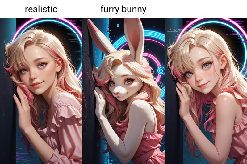
V8 can create furry aswell.
I'm looking forward to ur results and hope u have a lot of fun being creative.
recommended settings:
Euler a / Euler25-30 stepsCFG 5-7Clip skip 2_ might wanna be ur friend for tags☺ Showcase resolution: 720*1280. I would recommend using ADetailer for further distance.
+prompt example
masterpiece,best quality,amazing quality,very aesthetic,absurdres,newest,detailed eyes,-prompt example
u can leave emptyor
worst_quality, bad_quality,a little comparison of V7 and V8
about v7
V7 takes a big step back to the roots and yet somewhere completely different ~ quest: keeping the balance . . . focus on painting a 2.5D lightning effect by drawing the Illustrij faces. I'm curious to see whether u like it and look forward to ur creations ~♥
Please let me know if u like the new direction ☺
recommended settings: 720*1280 / Euler a / CFG 7 / steps 25+ / Clip skip 2
🐰 furry optional
about v6
The new versions spawns with a touch of 2.5 D remdering ~ with a flat-shaded anime style, but subtle 3D lighting and depth, making images look almost tangible.
I hope you like it and stay tuned for your results ~♥
showcase resolution: 1040 x 1510
prompt examples:
Prompting is basically similar to the previous versions. After playn around with and testing old quality prompts ~ at the moment I prefer to use "masterpiece, best quality, amazing quality, very aesthetic, absurd, newest, detailed eyes" or "masterpiece, best quality," for +prompt and "worst quality, bad quality," for -prompt.
Of course these are just examples, u can vary them to suit ur own taste.
about v5
hey guys, ☺
the gap between v4 and v5 was only a few days ago, but I've been "tinkering around" a bit and didn't want to keep it from you.

Trying to work on getting the quality closer to hires without hires - but there are still a few steps to go ^^
For people who have good hardware and can generally use a lot of Loras etc. at the same time the difference might not be that big, but I feel for the people who have small graphics cards :I
The quality isn't perfect, but I've been working on it a bit ~ soft filling, clean renderings ~ the plan was to create an own style, subtly painted ~ anime-based, but still kissed by reality.

I hope you like the merge and I'm really looking forward to your results ♥
Belonging to the style u prefer u can switch the promptings 4 sure by ur own taste. In general, I mostly use "masterpiece,best quality,amazing quality,very aesthetic,absurdres,newest,detailed eyes" for general quality prompting, and besides depending on whether I want more anime or anime semi 3D touched I am writing "A professional,high-quality,hyper-realistic portrait of a woman, 3D" for the semianime 3D version and "A professional,high-quality portrait of a woman" for anime e.g. or as a conclusion for semi-anime:
"masterpiece, best quality, high resolution, very aesthetic, absurdres, newest, professional, high-quality, hyper-realistic, portrait of a woman, looking at viewer, detailed eyes, realistic body,"
and neg.:
"(lowres:1.2), (worst quality:1.4), (low quality:1.4), (bad anatomy:1.4), multiple views, jpeg artifacts, artist name, censored, young, 2D"
Sometimes I either leave out the negatives completely or write, for example, "lowres, worst "aesthetic, bad quality, worst quality, bad anatomy, sketch, jpeg artifacts, ugly, young, soft rendering, face marks"
depending on whether I use Euler or Euler a as sampler ^^
Usually I structure my prompts based on this:
subject description: who or what can be seen? (what does she/it look like? hair, eyes, clothing, description of the scene),
light and shadow description,
which angle, perspective, motion? quality
and
detailed description
or the quality at the very beginning and then the rest of the structure :)
If u're tasty for more? Here is a lil insight into the prompt structure: https://civarchive.com/articles/10509/il-portreij-step-by-step
about v4
hey guys, ☺
for V4 I changed the recipe a little to improve the quality a tiny bit and also to expand the options for prompts.
about v3
style closer to V1 anime based with a lil qualy upgrade ☺
Showcase images without ADetailer
about v2
a lil more 3D touched without using 3D in promptings
by writing "realistic" the style will become more into semirealism and without its closer to a semianime based style
furry optional
a lil quality upgrade, just a lil ^.^
🌶️ sidefact for NSFW fans: viewer can interact with character by describing what hands can do (see sample images in the showcase)
about v1
If u like the style in the showcase images, u can add
high-resolution, realistic, 3D,
detailed skin, detailed eyes, shadows, dark light, eyelashes, upper body, cheeky, posing, holographic color,
to ur prompt. Without it the style becomes more anime based.
At further distance I would recommend using ADetailer.
Today I can't say yet in which direction the merger is developing, but as a pony and flux fan, I can only say that I love the color intensity of Illustrious. I recently tested it and got a taste for it, maybe you'll like it too ☺
I am happy if u enjoy and stay curious abt ur results ♥
a small comparison from V1 to V5
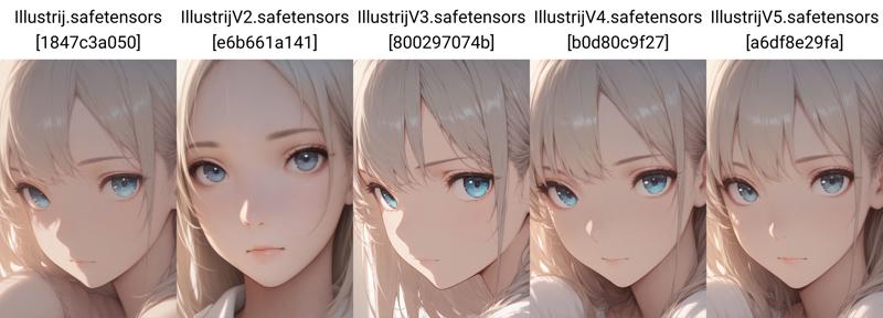 ⬆️ masterpiece, best quality, 1girl, face, portrait, looking at viewer, closed mouth, close up
worst quality, bad quality
~~*~*~*~*~*~*~*~*~*~*~*~*~*~*~*~*~*~*~*~*~*~*~*~*~*~*~*~*~*~*~*~*~*~*
I hope it gives a little impression of the development ☺
Description
VAE baked in
v21 tinkered with Illustrij v3, Illustrij v6, Illustrij v8, Illustrij v17, Illustrij v18
special THX to everyone making this merges possible ♥
FAQ
Comments (17)
Hey friends,
this time I thought I would let Illustrij speak for herself. ♥
v21 is woven from Illustrij’s core essences ~
a small experiment where I revisited every version, from v1 to v20,
to rediscover what truly feels like her.
From that exploration, from her center,
this new version emerged.
It wasn’t about making her “better,”
but about coming closer again.
I hope she brings you joy ~
the same quiet joy I felt while tinkering, testing, and listening.
I’m already excited to see the adventures you’ll take her on. ✨
If you’re curious,
v21 shares her own story here:
💌 https://civitai.com/articles/26631
with ♥ Reij
Yay yay yay, truly where imagination and reality meet! She is truly a gift to us all!
This is my favorite model ever. Thank you for blessing us with this upload.
Illustrij V21 can be said to be one of the pinnacles of the Illustrious model range.
21 seems to have very high weight that modifies the character's face. Also more vibrant/contrast that makes it less realistic.
For me, I prefer v16 and v18. It's easier to work with character Loras when I use these older versions.
I think it depends on what we expect from the model ^^
Illustrij, especially v21, is intentionally an identity-focused model, so it has a stronger face prior and consistency.
That can feel like “high weight” on the character, but it’s actually what keeps the identity stable across seeds.
Older versions like v16 or v18 are definitely more restrained, since they leave more space for external influence.
So it’s less about better/worse, and more about different model types:
– identity models (stable character, less drift)
– more open / flexible models (easier for LoRAs and variation)
Also, LoRAs and base models always interact in a complementary way.
The result depends on both ~ the model’s structure and the LoRA’s training bias ~ so it’s more of a dynamic relationship than a one-sided limitation 🙂
In a way, it’s a bit like communication ~ the outcome depends on how both sides “interpret” each other.
Both are useful, just for different workflows 🙂
21 was definitely a downgrade from 20.
Hey,
first of all ~ taste is different, and that’s completely okay.
I’d actually be curious what aspects matter most to you,
because everyone connects to different things in a model.
For me personally, I really love Illustrij,
and I see her less as a single version,
and more as a journey from v1 to v21,
and as an identity model rather than just a visual style.
For me, that means she isn’t defined by a single look,
but by how consistently she remains herself
across different settings, lighting, and prompts.
v20 was an important step.
It was a moment of returning,
trying to find her again after leaning a bit too far into “forced maturity.”
With v21, something shifted.
It wasn’t about making her better,
but about letting go of what felt slightly constructed.
What emerged for me in v21 is:
less trying, more being
less performance, more presence
less idealized smoothness, more small, real details
less “looking grown,” more quiet maturity in her expression
She feels more coherent to me,
more like the same person across different moments.
She’s like a small nose dimple now ~
and for me, that kind of detail says a lot.
It’s not about perfection, but about character.
That little bit of individuality,
that quiet imperfection,
is exactly where her charm lives.
Also technically, she became more stable:
she holds her identity across different CFG values,
with or without negative prompts,
and even when shifting styles.
So for me, v21 isn’t a downgrade,
it’s a step closer to her core.
But I totally get that different people value different things,
so I’d genuinely be curious what you’re looking for
Thanks for the reply.
I wasn't really talking about taste or the model's "journey." Sorry I didn't give specifics in my first comment. What I meant was that v21 has a noticeably stronger face/character bias than v20. It makes character LoRAs a lot harder to apply properly and reduces flexibility in general.
I get that you see Illustrij as this deeply personal, evolving identity with her own "presence" and "quiet maturity". For a lot of us though, these are mainly just practical tools. When a new version leans harder into "subtle details" or that "soul" at the cost of adaptability, it can honestly feel like a downgrade in usability.
All the flowery, poetic framing doesn't really add much substance. It mostly just makes it difficult to tell what actually changed under the hood. A bit more straightforward info on the mechanical side (like face weights, LoRA behavior, etc.) would make it way easier for people to pick the right version and give useful feedback.
I actually find this Checkpoint keeps getting better and better. In some ways, too fast—v21 already? Slow down. Lol. I love this Checkpoint! Clean, beautiful in every way. But most importantly, very stable and with few mistakes.
It has the best lighting, but 21 seems to have more of a "same face" problem unfortunately, really only usable with character loras.
thank you very much for you comment. Illustrij, like most of my models, is an ID model (identity model) ^^ so her face is part of the characteristics.
there’s a lot of love and sensitivity in how this identity is woven and held across seeds ☺
my models are more dialogue partners in the playground, which also includes the interpretation of prompts beyond style^^
I was reading a comment from Romangelo regarding v21 and i found his/her remark really interesting. Currently most checkpoint creators post heir checkpoints with very little informations about what it does. Having creators publishing their checkpoints with a score system would help a lot. Could you do such a thing with your creations to help us choose the version that ll match the best with our objective?
For exemple:
Prompt understanding/restiution: X/5
For how well that checkpoint understands a prompt and generate a picture that matches tags inside of the prompt.
Style knowledge: X/5
For how able is the checkpoint at generating a picture that matches the style tag inside of a prompt. For exemple tags such as "western comics (style)", "realistic", "photorealistic", "anime screenshot", "anime coloring", "flat color", etc...
LoRA compatibility: X/5
For how well the checkpoint ll handle any type of LoRA (character, style, concept, tool, background). Meaning that the checkpoint style won't break/crush/overwrite a LoRA that you want to use.
My models are a bit like small characters in an imaginary videogame ^^
but instead of playing, we paint the story together.
that’s the gameplay part maybe ^^
creating little playgrounds ~ spaces that are fun to explore.
I agree that a scoring system can be very helpful when choosing between checkpoints.
My approach? is a bit... how may I call it? "inbetween", I think?
Most of my models are what I call ID-models. This means they are not primarily designed to reproduce a specific style as accurately as possible. Instead, they have their own kind of “personality” in how they interpret prompts.
When I create or merge models, my focus is not on how well they can copy an existing style, but rather on what new and unique behavior emerges from the combination.
To be completely honest, I deeply appreciate existing styles, but I’m more interested in exploring and developing my own visual language. I spend a lot of time experimenting, and for me that’s a very artistic process.
That’s why my models are not meant to represent real people or perfectly reproduce known aesthetics. Instead, they are more like independent characters –~ with their own “face”, their own expression, and their own way of interpreting a prompt.
They are not real in a literal sense, but they aim to feel artistically coherent and believable in their own way of expression.
Because of that, prompting these models feels less like giving strict instructions and more like having a dialogue. The same prompt can lead to slightly different results depending on how it is phrased.
That’s also why my model descriptions tend to be a bit longer –~ they are meant to give insight into how the model “reads” and responds to prompts.
Over time, I’ve started to weave more and more of my own artistic “handwriting” into my models – through perception, perspective, and the way I approach merging. This has become much stronger now than it was a year ago.
But I’m still learning – I’ve only been doing this for about 1.5 years. So this is very much an ongoing process of exploration and practice for me. Each model is a step in that direction, not a finished endpoint.
I do understand the value of a simple scoring system (like prompt understanding, style control, LoRA compatibility, etc.), and I might add something like that in the future as a general orientation.
However, on a personal level, I don’t really think in terms of rating or comparing models against each other.
I’m less interested in asking “Is model X better than model Y?” and more in observing how a model evolves over time.
This is more of a personal, human perspective –~ and it naturally flows into the way I approach merging.
Instead of optimizing for rankings or direct comparisons, I treat the process as something more organic: a continuous development of identity, perception, and expression.
That said, for my own models, I would probably include something like “identity” or “interpretation strength”, because that’s really at the core of how they work.
And in a way, that is already what I try to express through my model descriptions.
I put a lot of care and detail into them, because they are meant to reflect exactly this idea of identity and interpretation.
That’s also why my descriptions might sometimes feel more like introducing a character than documenting a tool.
I’m trying to open a space where the core characteristics of the model can be understood –~ not just in terms of visual output, but in how it perceives and responds.
And I do understand the desire for a clear overview –~ I’m in the same situation myself, my drives are almost full by now.
I also bring in my own perspective, shaped not only by my technical work, but also by my personal and professional background.
It’s just one perspective –~ but it’s the one I have, and I try to be conscious about it.
Especially because I know that not everyone can download and test every single model, I make an effort to describe their characteristics as clearly as possible.
In a way, it’s a bit like dating:
The goal is to give enough of a feeling so you can decide
“Is this something I want to explore further?”
or
“Maybe this one isn’t for me.”
To come back to the mentioned comment:
LoRAs may appear a bit like characters too – each with their own structure, their own bias, and their own way of adapting.
That’s why interactions can feel very different, depending on how both sides come together.
And regarding your question about a scoring system to help choose the “best” version:
I do understand the wish for that kind of orientation – feedback is very important to me as well.
But at the same time… I’m not sure how I could define that in a universal way.
I am working on a more multidimensional system, but that’s quite a process – and I’m still far from finished.
So for now, I’ll continue describing my models through artist notes ~ focusing on their individual characteristics, their visual behavior, and giving a small overview for image generation.
Everyone brings their own perception, their own way of prompting, and their own expectations.
What works perfectly for one person might feel completely different for someone else.
So instead of saying “this version is better for X,”
I try to describe the characteristics of each model as clearly as possible –
so people can get a sense of whether it resonates with them or not.
Really, I do understand the desire for comparison.
But it’s a bit like cooking – some people prefer rice, others prefer pasta.
What I create isn’t meant to taste like something else… it’s meant to be its own dish.
Maybe this is where my perspective might differ a bit.
For me, I’m curious about what sparks beyond the first glance... beyond style, beyond appearance.
I’m interested in what makes something unique at its core –~ what kind of behavior, character, or way of “seeing” sparks in~between?
That’s how I approach things in general, not just with models. I’m naturally curious about what’s beneath the surface,
what may be visible, insight and in sight? ^^
And that’s exactly why my models and descriptions reflect this perspective.
It might not be everyone’s taste –~ but it’s my kind of art.
^^ To come back to your points:
Prompt understanding / restitution is actually something I care about a lot.
As you might notice, language is very important to me – I love words, and I pay close attention to how prompts are interpreted.
At the same time, it’s still my way of reading and understanding prompts that flows into the models – my perception, my language (and since each of my models has its own characteristics, they resonate with this in different ways – which I try to describe in the model descriptions).
And without language understanding, there is no real interpretation.
But whether that interpretation matches someone else’s taste… I can’t really define that. That part is always individual.
LoRA compatibility is a topic on its own.
From my perspective, it’s very hard to generalize.
There are too many variables:
how the LoRA was trained
which base model was used
how training images and base interact
what settings were used
Because of that, I don’t think it’s possible to give a clear, universal rating – unless we test each LoRA individually.
That’s just my personal view on it.
And regarding style knowledge:
As mentioned before (in the tiny novel above ^^), that’s not really my main focus.
I’m not trying to reproduce existing styles as accurately as possible –
I’m more interested in creating something new and emerging within.
First of all, I really like this model. I am using it for a semi-realistic Panam Palmer image/video. Everything was going perfectly with my image generation until I tried to add more reflections on wet/slick skin. No matter what LoRA I tried or what prompt I used or what settings we manipulated (even had ChatGPT and Grok have a go at it) we couldn't get the reflection on the skin to the level I wanted.
Any suggestions or advice?
Hey :)
thank you very much for your kind words and feedback ♥
I’ll definitely keep that in mind.
Do you mean light reflections on the skin specifically,
or more generally a wet/slick skin effect,
or that the skin should appear less matte overall?
This is actually a great moment for feedback 😄
before I dive into the next steps,
so I can take another look at it.
I was originally planning to take a short break from merging,
but I’ll see if there’s something I can explore there.
Right now I’m still thinking about Illustrij’s next steps ☺
@reijlita Thanks for responding. Getting a wet look wasn't a problem. It's getting her skin to reflect the lights was the problem. It would reflect a little bit on the obvious high points (shoulders, forehead, top of the breasts, etc) but trying to make the reflections bigger was impossible, regardless of the prompting or LoRA used. It's definetely not a deal breaker, but if there is anyway to increase the reflections on her skin it would be great.