Anima version is available!
Nova Furry XL
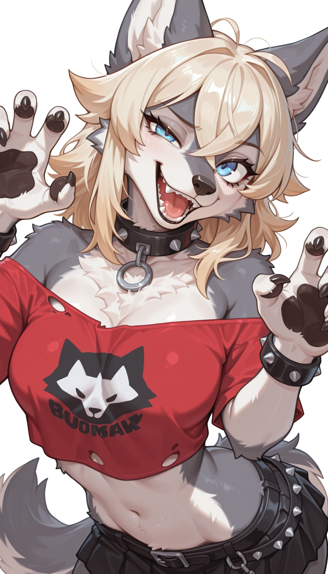
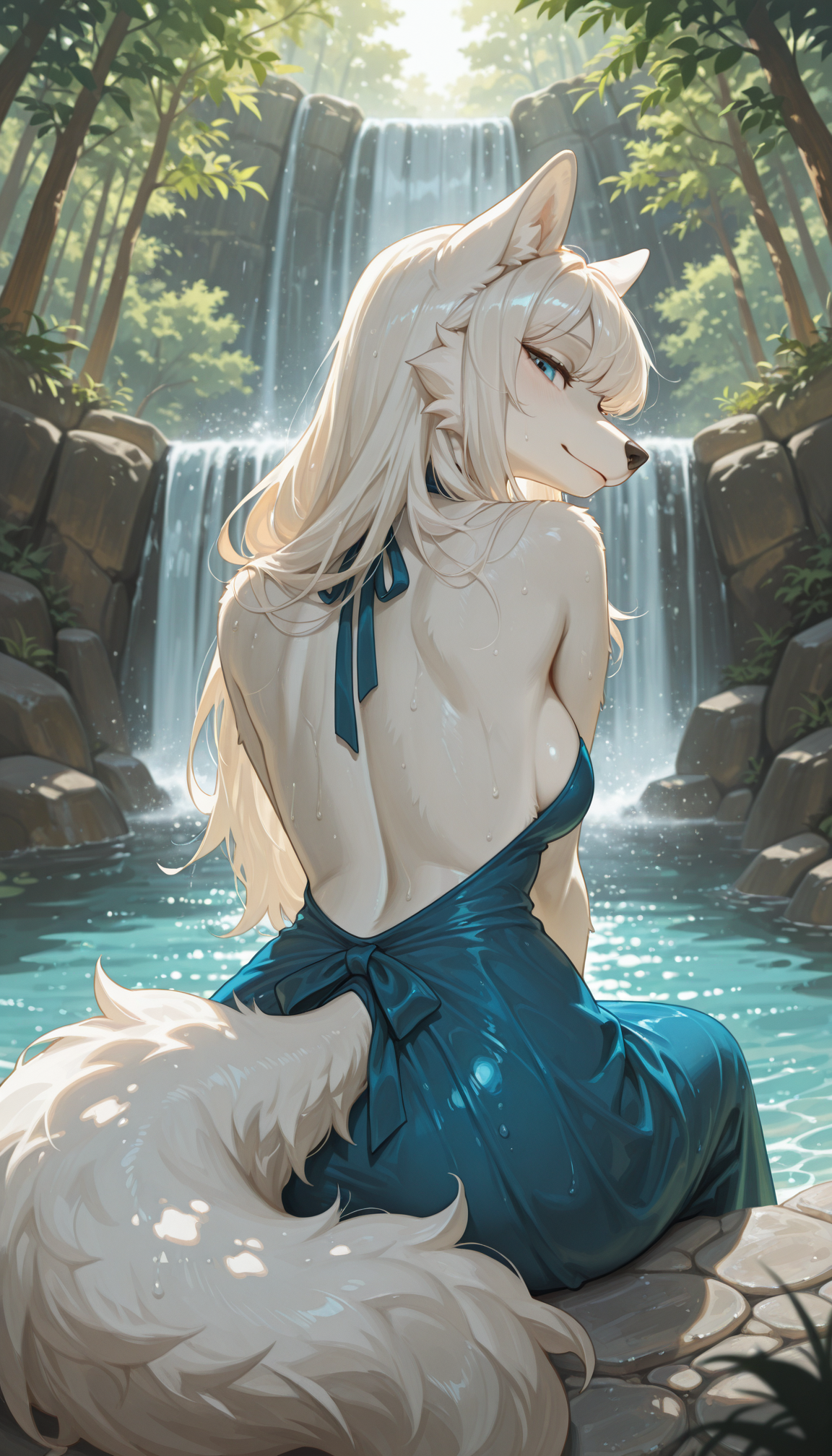
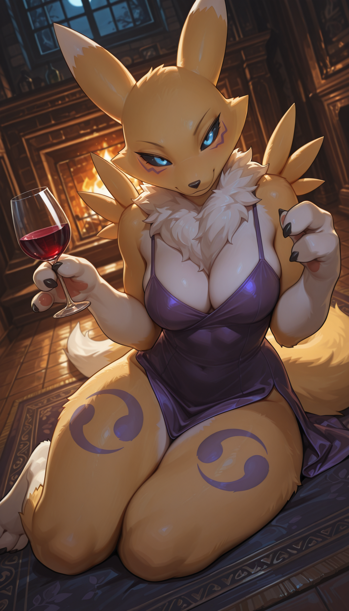
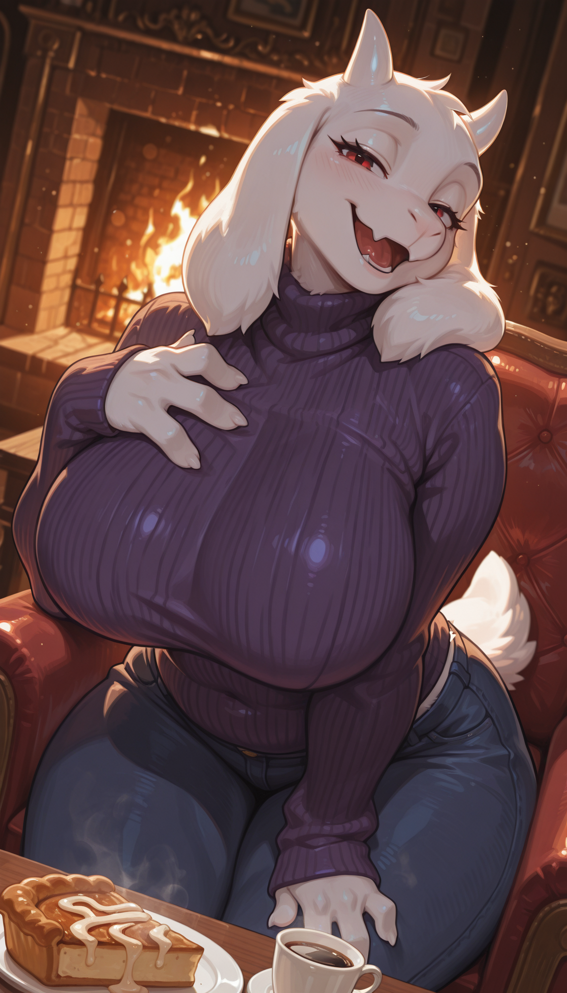
A 2d/2.5d furry checkpoint model that can have great details on any type of furs, scales and feathers, which aims to be XL-fied Peaki Furry
Rules
You cannot use the generated images for commercial use if it's not edited (or just turning it to black and white)
Advertising is always welcome
Recommended settings:
Sampler: Euler a for best performance
Steps: 20-50 steps
(Pony)
CFG Scale: 6-7
Prompt: score_9, score_8_up, score_7_up, score_6_up, score_5_up, score_4_up, source_furry, BREAK, furry, anthro, detailed face eyes and fur, {Animal Type}
Negative Prompt: blurry, jpeg artifacts, username, watermark, signature, normal quality, worst quality, large head, low quality, text, error, missing fingers, extra digits, fewer digits, bad eye
(Illustrious)
CFG Scale: 3-5
Prompt: masterpiece, best quality, amazing quality, very aesthetic, high resolution, ultra-detailed, absurdres, newest, scenery, furry, anthro, {Prompt}, BREAK, depth of field, detailed fluffy fur, volumetric lighting
Negative Prompt: human, multiple tails, modern, recent, old, oldest, graphic, cartoon, text, painting, crayon, graphite, abstract, glitch, deformed, mutated, ugly, disfigured, long body, lowres, bad anatomy, bad hands, missing fingers, extra digits, fewer digits, cropped, very displeasing, (worst quality, bad quality:1.2), bad anatomy, sketch, jpeg artifacts, signature, watermark, username, simple background, conjoined, bad ai-generated
Description
Fix VAE / Embedding issue and adjust colors
NoobAI EPS v1.1 + Illustrious v2.0-stable DARE applied
FAQ
Comments (37)
V10 and V3 were my favorites. This feels like a perfect mix of both of them.
While the last 3 models were great.
I personally find V14 to be the ultimate version.
everything is alot less chaotic and noisy in the backgrounds.
This is a huge step in the right direction.
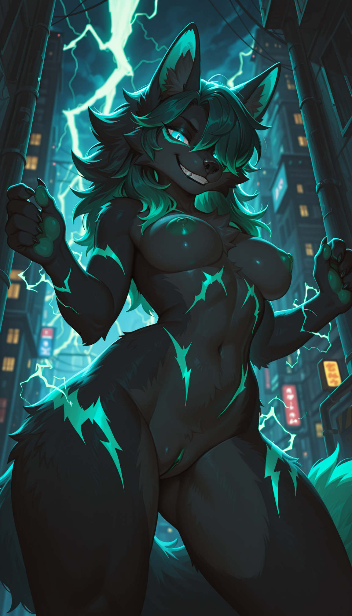
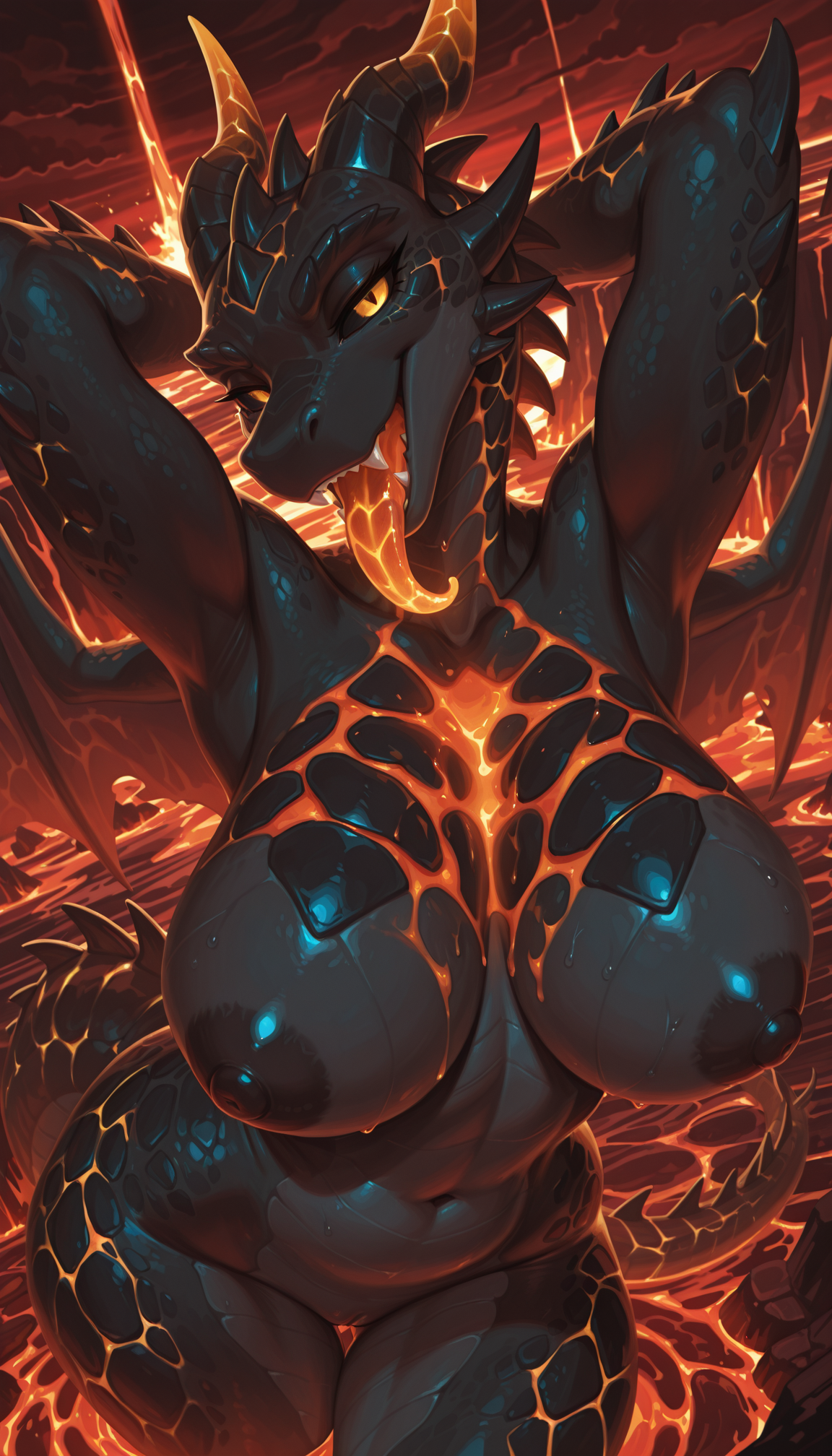
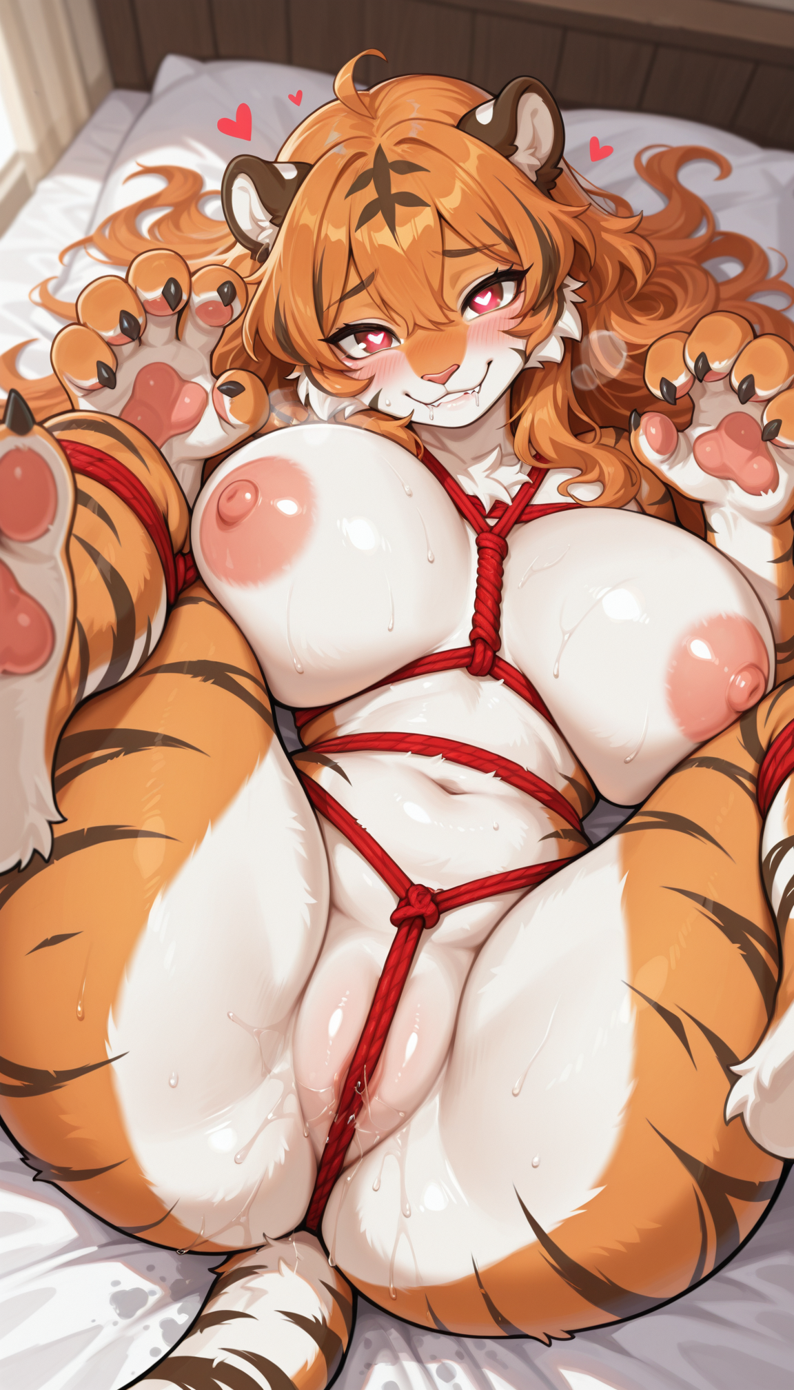
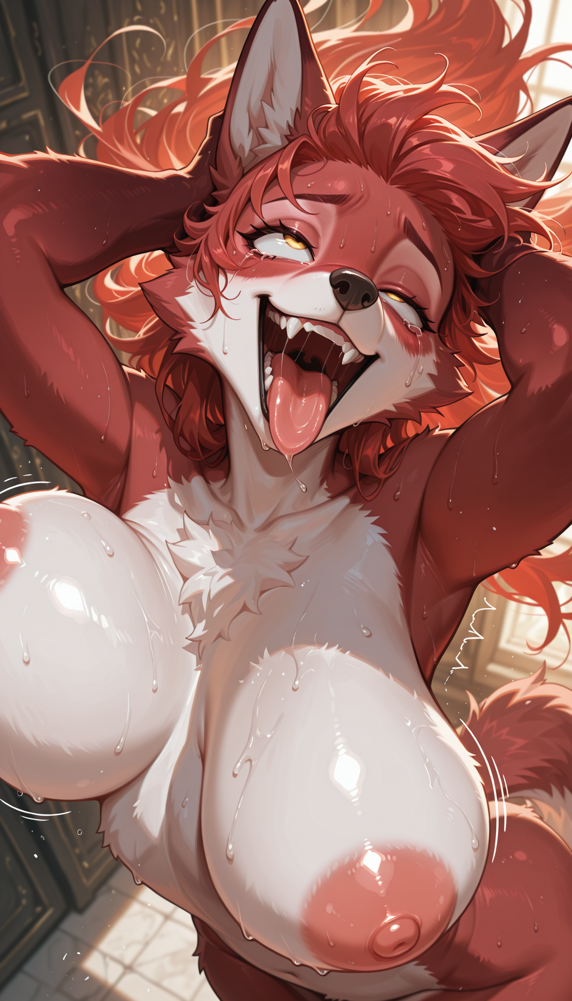
Dont forget this, Nova Furry's reputation is to give that glossy 2.5, kemono style
Dont go flat 2.5d because its trendy with some creators and their users.
Youre model is an ICON of the glossy, shiny, 2.5D style. Especially for furries.
Never forget that, and you will continue to have great success.
Is it possible to summon that glossy 2.5 nova style with a prompt for more control? Some settings, chars and species seem to override it. It should be trained into future versions as a specific style that can be prompted esp. if Nova moves past SDXL to z-image or something else in the future.
Flat 2.5D is one of the reasons I bypass most anime models. I don't enjoy that look. I want depth, shading, lighting, gradients. Those extra little intricacies that just make the images pop. Edit I wasn't insinuating I pass by this model - I download most of your models @Crody though I will play with those tags a little more. I do appreciate your works.
@J35 @Kaladae For glossy 2.5D style (like A versions), try using "realistic" in the prompt
For flat 2.5D style, try using "anime coloring, high contrast" in the prompt
Coming from using 11, then 12, and currently using 13.5. I had high hopes from 14. I was hoping to see the best of 12 and 13.5, and what I have found is a flat out downgrade across the board.
Update: I tweaked with my settings a bit. What made 11, 12, and 13.5 flourish didn't really work with 14. I made some adjustments and 14 is pretty good. I don't think I am fully making the switch, but I will keep 14 in my library.
only 12391293 more to go, you got it
Gotta get on that grind fr
Definitely one of the greatest models out there, even if you're not making furry characters, the details and the lighting are great, and the adherence to prompt is really good, keep up the good job, this model is my favorite ! Thank you :)
What other models would you say surpass this one? I'm using this one and not even doing furry. Seems to work better than the anime/non-furry version :)
V14 is definitely an upgrade over V13.5, but I still feel like V12 is better. Still, V14 has its strengths and I will be keeping it in my library and switch to it if V12 struggles with something.
Can you elaborate? I am still on V12. Characters are mostly fine for me. Still messes up toes now and then (making 3 or 5 instead of 4) but that probably will always remain a core model issue. I wish it was more clean and detailed with backgrounds and especially city scenes.
I'm gonna be honest I can't tell the difference of anything above v12, possibly because I've ONLY used v12, nothing else really
But I'm probably biased about that, because I use banana splitz and cinema.
Nooo :c give us back the v12. It was best one.
V14 is incredible! The eyes look much better than the V13.5 - especially for furries with black sclera - no need for intense Hires Fix
Definitely my favorite version so far. Awesome work! :D
nich
Overall great job @Crody - each iteration focuses mostly on the characters (fur, eyes, fingers...) which I regard as 'great enough' by now! But how are the chances you improve things like landscapes, towns and cities? In the macrofurry fandom these are crucial, but it could also benefit other users, who desire more than creating standard portraits! Issues that I still observe:
- Inconsistent cars, sizes mixed up, sometimes simply too many get added, things like "vehicle crushing" barely work, sometimes they get 3 wheels
- Streets look bad in most cases. Adding "sidewalks" can help, but just a little. Usually too many lane markings get added.
- Adding "streetlights" or "power poles" often makes them too big, the same can happen for trees, unless weights get reduced like [[trees]]
- Prompts like "cracks on asphalt" could work better. Sometimes the giant character also rests on a separate 'blob' of brighter tarmac, which looks weird. Cracks almost stop working at all, when mixing in NovaAnimalXL
- Buildings barely deform upon contact by a macro. When using Affinity/Photoshop to gently wrap them manually, then upscale, it even tends to changes them back to straight lines, unless using denoising <0.2
- Prompts like "leaning on building" or "hand placed on building" don't work reliably (mixed results). When a giant hand is placed on a building, I also expect cracks to show up more reliably.
- If you want to add a river or channel to a city (e.g. to mimic Manhattan), it often mixes a road with water. It works better when the perspective is set from above
- Footprints/pawprints still don't work at all since v1.0, would be appreciated if you can include more material in your training dataset
- I usually avoid prompts like "city destruction" entirely, as that leads to typical 'AI look' images with building sizes totally mixed up
- Certain landmarks like "Eiffel tower" appear way too big compared to the surrounding buildings. Or duplicates appear when prompting something like "Paris"
- Biggest issue are "burning buildings" or "buildings on fire". For whatever reason, if it works at all, it often adds random fire spots that look more like campfires, and even worse, it often puts the character on fire, usually around its genitals (lol). It also tends to add explosions or lava-like effects. My old SD1.5 based indigoFurryMix was far more reliable in that regard. Please add more of that prompt into your training dataset as well.
If I had the GPU capacities, I could have given it a shot myself with a custom LoRa, but I think its better if the core model itself gets more robust here, so a LoRa can focus on specific character/styles. Thank you so much for considering! If I see solid improvements, I will happily donate something 🙏
Honestly, in general, I would consider the content you're trying to create more of a job for inpainting. Not sure if you generate here or locally, but if you're generating locally, I would definitely approach this by rendering the city from the perspective I want (far, and whatever angle), and then use novafurry to paint in the macro characters. Detailed cityscapes are pretty intensive on their own, and getting an image this complicated to look good is fairly rare considering the randomness of generation.
I would go the route of >generate city > paint in characters > paint in finishing touches (ie this building looks good, but it should be getting toppled over by this 400 foot tall otter right now, not standing up). This allows the AI to focus all its power in a much smaller area, which leads to better accuracy in your images.
amazing, i cant figure out how to put letters on a shirt for example.
This is an illustrious model - it can't handle writing on its own, so you either need a lora for the shirt + text, or use a different model that can handle text (like ZImage, but there's no Checkpoint that comes remotely close for that).
Inpainting with ZImage or Qwen might be an option. They can handle t-shirt text just fine.
Hi! What version of the Illustrious model is this based on?
Asking to know which resolution, prompting (tag/language) to use for best results :)
Latter versions are based on NoobAI EPS v1.1 and as far as I know, it's capable of creating 1024 x 1536 resolutions as well
Hey Crody! Great stuff love your model I donated some buzz, faved the whole nine. Trying 14
Will
Will we ever get any improvements or will it be the same thing over and over again?
I'm planning to make it on Z-Image but right now, I cannot guarantee the immediate upgrades
If there's new variant of Z-Image which is trained on Illustrious, I'll do it
@Crody Apologies, I know jack shit about merging, and your model is the "golden goose" that everyone seems to use. I will admit that I am a bit jealous of your success.
Один из лучших checkpoint, на мой скромный взгляд. Генерирует не только Furry, насыщенные цвета отличная детализация, NSFW+ не дает артефактов. Хорошо откликается на Lora.
Однозначно рекомендую!
Совершенно верно.! Меня вначале слово Furry, смутило, думал что элемент животных будет где-то проскальзывать и проявляться - но нет, если надо сгенерировать 100% человечность, достаточно скорректировать негативно-позитивный промпт. НО - при генерации головы в профиль, заметна лёгкая прорисовка подьёма носа и верхней челюсти как у Furry - это забавно, и в некоторых случаях даже красиво.))
I really love this checkpoint. It's brought my image genning to the next level. However, I have noticed that it doesn't like doing multiple characters well. Especially with Regional Conditioning. It's made doing more complex generations nearly impossible as it seems to ignore masking and all attempts to separate the characters. Is there any plans to improve this?
I have found that using a regional prompter (Comfy Couple in my case) and then passing the results through a second Ksampler gets me really close. The key for me is I use a condition combiner to combine the two positive prompts into one for the second sampler. With this setup, the first sampler provides the second with posing and rough details. The second sampler then denoises the image with combined positive prompts and now has a better idea how to separate and apply the details. I usually run a .45 - .65 denoise on the second sampler.
OMG! v13.5 is back! Such an amazing version actually. It does give a lot of detail on the skin/fur/scales
How do you get high quality on mobile
@LGD_5K find Upscaled image - usually tagged with Remacri
really good model
Crody, do you have any idea why there is zero prompt recognition for Rams aka Male Sheep? I have tried everything and they just generate as a random wolf everytime. Is there no training data in the model for that animal? I mean I have has like a 30% success rate of Male Sheep but even then if there are multiple characters it usually tries to revert the sheep to a female if its a straight couple.