Anima Version is Available!!
Nova Anime XL
Nova Anime XL is Nova Anime: Anime/2.5D/3D checkpoint model for SDXL
Pony version aims to get the similar look as both Nova Anime and Nova Domain
All images on example were created with diffusers with custom png tags
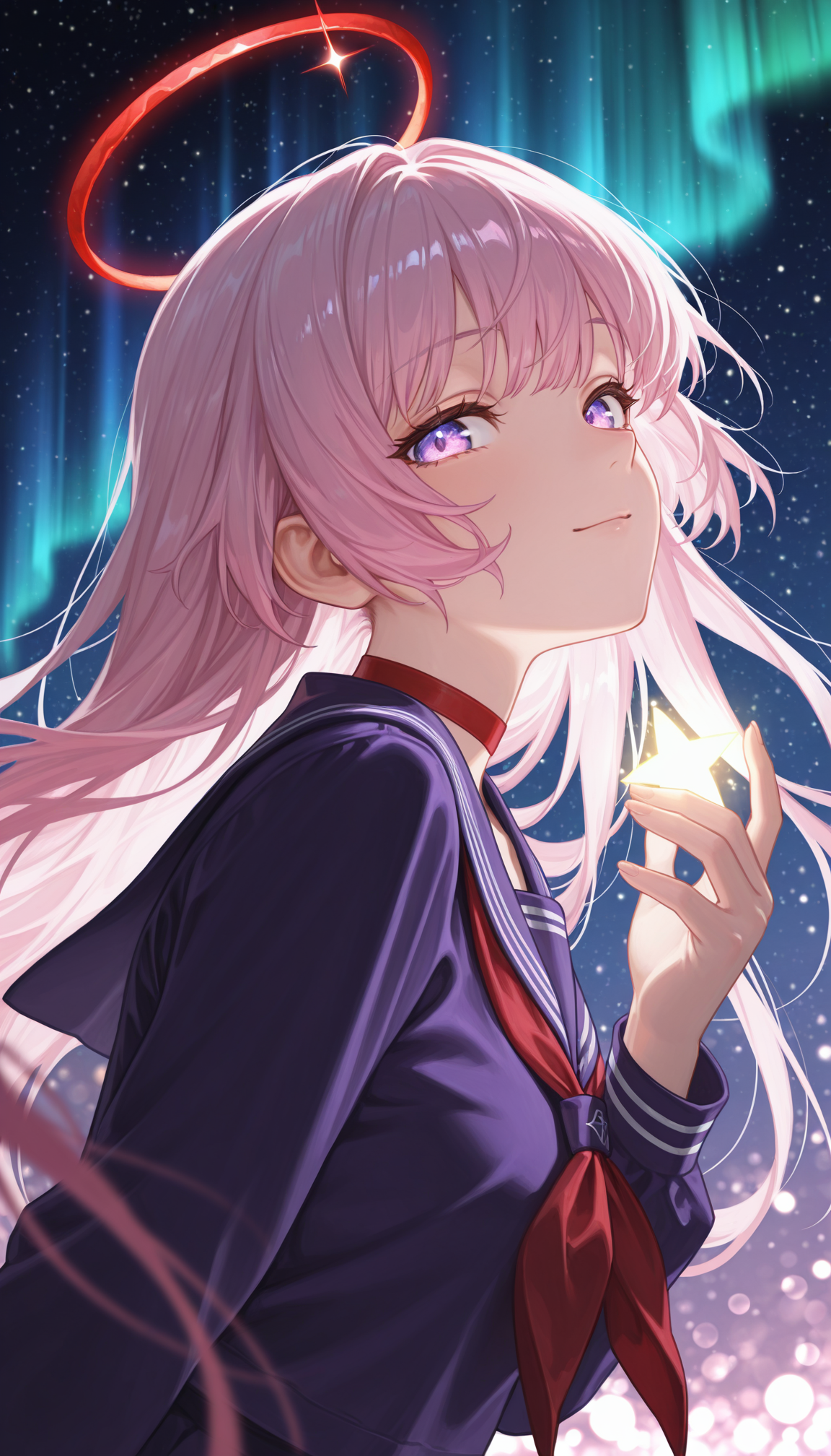
PixAI - IL v4.0 Happy Valentine
PixAI - IL v3.0 Happy New Year
PixAI - IL v2.5 Merry Christmas
Rules
You cannot use the generated images for commercial use if it's not edited (or just turning it to black and white)
You can share images without any restriction if you don't monetize it
Advertising this model to outside is always welcome
Recommend Settings
Sampler: Euler a
Steps: 20~30
Clip Skip: 1-2
Denoising Strength: 0.65 - 0.8
(Pony)
CFG Scale: 5~7
Prompt: score_9, score_8_up, score_7_up, score_6_up, score_5_up, score_4_up, source_anime, BREAK
Negative Prompts: score_4, score_5, 3d, jpeg artifacts, username, watermark, signature, normal quality, worst quality, large head, low quality, text, error, missing fingers, extra digits, fewer digits, bad eye
(Illustrious)
CFG Scale: 4~6
Prompt: masterpiece, best quality, amazing quality, 4k, very aesthetic, high resolution, ultra-detailed, absurdres, newest, scenery, {Prompt}, BREAK, depth of field, volumetric lighting
Negative Prompts: modern, recent, old, oldest, cartoon, graphic, text, painting, crayon, graphite, abstract, glitch, deformed, mutated, ugly, disfigured, long body, lowres, bad anatomy, bad hands, missing fingers, extra digits, fewer digits, cropped, very displeasing, (worst quality, bad quality:1.2), bad anatomy, sketch, jpeg artifacts, signature, watermark, username, signature, simple background, conjoined,bad ai-generated
Description
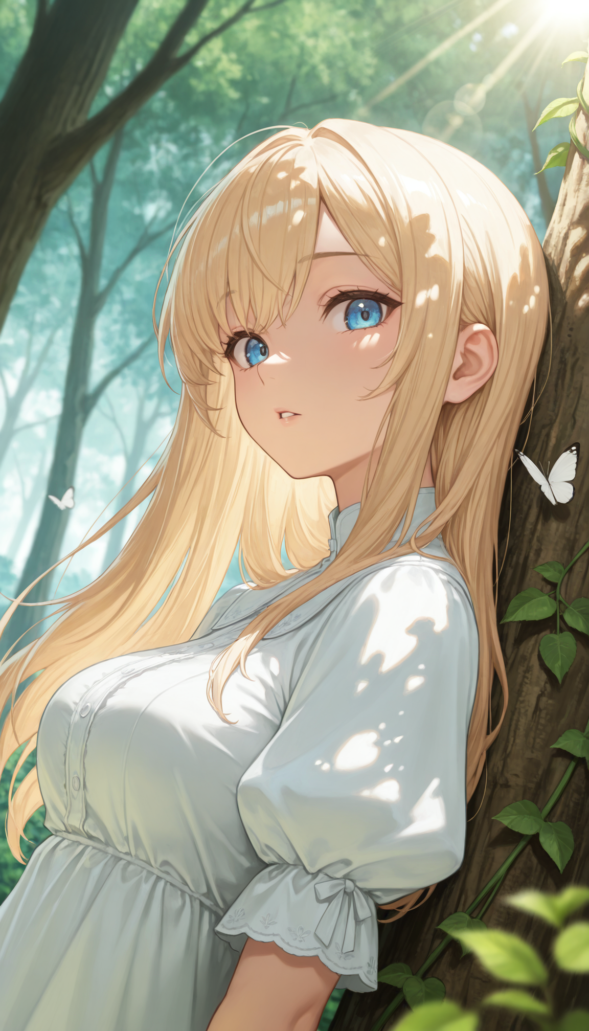
Detail enhancement for backgrounds
NoobAI EPS v1.1 + Illustrious v2.0-stable DARE applied
FAQ
Comments (29)
In v12, the background tends to look more realistic, so preferences may differ.
(Addendum)
v11 has high contrast and vivid anime-style painting.
v12 has more detail and a milder painting style, which makes it seem less anime-like.
In addition to this, is v12 better than v11?
@sekaiwlc07860 It's a matter of preference, so let's wait for a lot of posts.
@sekaiwlc07860 v11 better for anime-styled arts
Did some first tests, and honestly, v12 feels way more realistic than anime-styled. Eyes looked better in v11, colors were more vibrant too. Maybe v12 has more detail in objects, but not really sure. So far I don’t see any clear advantage over v11. For me, anime vibe and strong colors are key, so I’m sticking with v11 for now.
I tried v12 and feel it doesn't differ much from v11. What I was most looking forward to in v12 was the model updating with poses like outstretched_legs, feet_on_table, and others ,but they didn't appear. I find it pity
Problem is that the minor tags are really hard to pull off with current limited resources
I hope someday new Illustrious version like v3.0 gets released publicly
That's required to retraining a base model which is very expensive.
@Crody Got it. Your model is still great though,keep going
When comparing v11 and v12, I feel that v11 had a more anime-style look. In v12, the lines have become thinner and more delicate, so even with the same prompt, the result looks like a completely different person. (For example, it seems to have a big impact on the thickness of the eyelashes.)
That said, v12 appears to have a slightly wider range of expression and more detailed rendering than v11, so I plan to keep using v12.
However, when I try to create a LoRA, it doesn’t seem to work well with v12.
V12 has unique CLIP that includes both EPS and V-Pred elements and that probably affects with the system
The V12 model comprehensively outperforms V10, while compared to V11, the difference lies mainly in artistic style. V11 features higher contrast—especially in shadow areas (I find its shadows overly dark)—and more saturated colors. Personally, I prefer a cleaner, simpler aesthetic, so I’d choose V12. To my eye, V12’s color palette resembles traditional Japanese anime, whereas V11’s looks more like contemporary illustration.
v12 have improved eyes detail and more vibrant colors, in exchange for overall sharpness and shadow quality the compare to v11
nice
very good
Заметил проблему с глазами, что они как краска расплываются в воде, для меня это не критично, так как проход с детализацией всё устраняет.
оу,ну
Great model! I like it ❤
I really love this model — much more than similar ones on Illustrious. However, when I try to use img2img or inpaint, I get the following error while using A1111:
NansException: “A tensor with NaNs was produced in Unet. This could be either because there’s not enough precision to represent the picture, or because your video card does not support half type.”
This error doesn’t occur with other chekpoints
My GPU is a GeForce 4070 Ti Super. What am I doing wrong?
I have mixed feelings for this, it's nice that the backgrounds are better... But this has a side effect of making the images more realistic than necessary, and it also looks weird for my character that primarily uses 2.5D style (kind of)
This is going to be a rewind back to v11 for me, until the style returns back to normal
EDIT: After playing around in v12 for a bit, I think it could've been a nice model, but that weird style bleeding (or something like that) is making it look like a drawn 3D image and since the anime effect isn't visible even with the tags, you can't get that anime style.
I feel like this update would be a lot nicer if the realistic parts don't conflict so much to the anime style
yeah pretty much aligns with what i found from my tests. this would be a great update if this was not an anime style model.
The good: random generations have become more beautiful. Style is a matter of taste.
The bad: the style is inconsistent and depends on the fandom character used. Facial controls have become worse. Colors have become dull, in some cases it's downright terrible. Generations that go out of frame have become more frequent. For better stability, it's necessary to manage the "Realistic" weight and its presence in the negative.
Sadly, based on the final impression, model 11 feels better than model 12.
Wish the model knew komano manato
Update:
Based on the impressions, I'll make IL v12.5: which is similar to IL v11.0 while having better details on background (not realistic)
This new version will be available next week (6 days later, next week's Wednesday)
based
Thanks, V12 is one the big reasons I went back to V8 and V10, was the style. V12 for me just seemed to similar to Nova Orange.
v 12.0 pros:good compatibility, background and anatomy.
cons:has some prompt bleeding, if you have a red hearring for instance it has a chance to make tips of hair or end of the collar red. still at best 2.5D and can't get the "anime" look